Unambitious goals might hold the economy back—again.
Why is a Fed president so sanguine about falling labor force participation?

One of the biggest problems of the slow recovery of the 2010s was that policymakers had low expectations—they thought we couldn’t be doing any better or going any faster. The result was that it took until 2017 for the unemployment rate to return to its pre-recession lows, and even longer for many discouraged workers to return.
While this recovery has been much faster, I see worrying signs we will make the same mistake again. A presentation given by St. Louis Fed President James Bullard caught my eye yesterday. It suggests that once again policymakers may end up holding back the recovery by underestimating what the labor market can do.
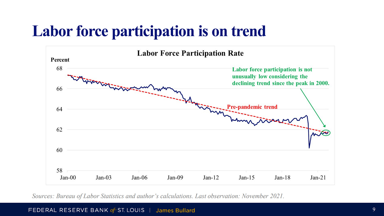
Here’s the graph that caught my eye. It shows labor force participation: the share of Americans who are either employed or looking for work.
From the St. Louis Fed’s press release:
Bullard added that labor markets are very robust, according to key metrics. He noted that the labor force participation rate (LFPR) is sometimes cited as a relatively weak aspect of current labor market performance. “However, the LFPR has been on a downward trend since 2000 and is not currently unusually low, once the trend is taken into account,” he said.
It is inevitable that labor force participation should decline some over time because seniors are increasing as a share of the population. But this trendline greatly overstates that effect by capturing some cyclical job loss.
Here’s the problem: it is not what we’d call a “peak-to-peak” trend line. It starts in January 2000, at the very top of a business cycle, and puts that directly on the trend. Then rather than aiming for the February 2020 peak, it ends up below. It’s more like “peak-to-mid-cycle,” intersecting the actual data series in the mid-cycle year of 2017 rather than early 2020.
The trendline, as drawn, essentially bakes in part of the Great Recession as a long-run inevitability. But the Great Recession was undesirable, and our economy as recently as two years ago was exceeding the trendline. Why not target that again?
Hitting the brakes too early
Why does Bullard’s opinion on the labor market matter? Because he is part of the Federal Reserve system, and the Federal Reserve has a role in deciding how hot we run the economy. The Federal Reserve is able to influence the level of spending in the economy by setting short-run interest rates.
If the Fed pushes down interest rates, consumers can afford larger mortgages, spurring the housing sector. Some investors will shift out of government bonds and towards financing real investment to pursue higher yields. Both responses will boost spending. Alternatively, the Federal Reserve can slow the economy down by targeting higher interest rates.
The Fed’s ultimate goal should be to arrive at full employment and stay there, but not try to push beyond. The Fed is like a driver tapping the brakes as the car glides into a parking space. To do this correctly, the Fed has to know where the endpoint is.
To do what Bullard did—to draw a trendline that falls short of the peaks, and say that being on that trendline is fine—is to slow down too early and stop before you’re fully into the space.
This has happened before
We made much the same mistake in the 2010s. Rather than acknowledge that we were short of full employment, economists tended to excuse poor cyclical performance as part of a longer structural trend. For example, in 2015, the late Alan Krueger, a respected labor economist, asked “How tight is the labor market?” and dismissed poor labor force participation, writing the following:
Today, the labor force participation rate is nearly 5 percentage points below its peak. Sensible analyses suggest that about half of the 15-year decline in labor force participation is due to predictable demographic changes, particularly the aging of the Baby Boom generation.
As for the other half, I think there are two important factors. About half of this remainder (or a quarter of the overall decline) can be accounted for by trends that were taking place before the Great Recession and likely continued after it.
For instance, the widespread entrance of women into the workforce that had fueled the great postwar rise in labor force participation in the United States peaked around 2000.
Male labor force participation, which had been steadily declining throughout the postwar period, continued to fall during the 2000s.
Krueger rightly noted that some decline is due to demographic changes, and should continue. But he also considered a more general trend of falling labor force participation, especially among working-age men, to be normal and maybe irreversible. This view, that the labor market was already fairly tight in 2015 despite low participation, contributed to premature rate hikes that slowed the recovery.
And the putatively irreversible trend reversed. Labor force participation began rising shortly after Krueger’s piece was published, and continued to rise all the way until the beginning of 2020, as a stronger economy convinced more Americans to try their luck in a better labor market.
Today, Bullard seems to be making much the same error as Krueger did—drawing a trendline heavily weighted on 2000-2015, and assuming there’s nothing to be done about it. But Bullard has the benefit of extra years of historical experience. He should know we can do better because we did better in the late 2010s.
Bullard is oddly sanguine about people out of work
Bullard’s presentation also had this puzzling trio of bullet points, with an accompanying graph. Bullard writes:
The LFPR is not robustly correlated with a rising standard of living in the U.S. data.
• In 1976, the LFPR was about the same as it is today.
• From 1976 to 2000, the LFPR grew alongside of the U.S. standard of living (real income per capita), a positive correlation.
• But from 2000 until today, the LFPR declined while the standard of living continued to rise, a negative correlation.
And he attaches this chart, illustrating the point:
This is astonishingly unconvincing. Bullard notes that our standard of living has generally risen over the last 44 years regardless of what happened to labor force participation. But this is obvious: technology has made people more productive and richer. Of course standards of living generally go up. Ideally, you might use econometrics to control for that.
But even on Bullard’s chart, without controls, you can see that labor force participation really is correlated with standard of living. During recessions, like 1990, 2000, 2008, and 2020, when labor force participation falls, GDP per capita halts its growth or falls as well.
The Federal Reserve Act mandates that the Federal Reserve should conduct monetary policy “so as to promote effectively,” among other things, “the goals of maximum employment.” So why is a Fed president making dubious arguments about why employment isn’t so great and we already have enough of it?


