24 charts that show we’re (mostly) living better than our parents
Ignore the haters: living standards have improved a lot since the 1980s.

If there’s one thing the left and right seem to agree about, it’s that the US economy’s best days are in the past.
“More than a decade of reckless fiscal policies have devalued the US dollar to the point that middle-class people can barely survive in the United States,” Fox News host Tucker Carlson claimed in March.
“In America today, our younger generations, through no fault of their own, now [have] a lower standard of living than did their parents,” Sen. Bernie Sanders (I-VT) said last year. “The American dream is going backwards.”
There’s no doubt that the inflation of the last year has lowered living standards for many Americans. But pundits and politicians have been talking like this for years. During his 2016 presidential campaign, Sanders declared that “our standard of living has fallen” and “the American dream has become a nightmare.”
Donald Trump concurred, stating in 2015 that “the American dream is dead.”
But have average Americans really suffered from falling living standards over the last 30 or 40 years? I’ve spent the last month researching this question, and the data I’ve found simply don’t back up these claims.
Not every facet of our economic life is improving, of course. College tuition has risen a lot, and so have rents in some big metro areas. But even in problem sectors like health care, housing, and education, the situation isn’t as grim as pessimists claim. And there are many other areas of economic life where we are unambiguously better off than our parents.
1. We’re eating more fresh fruit
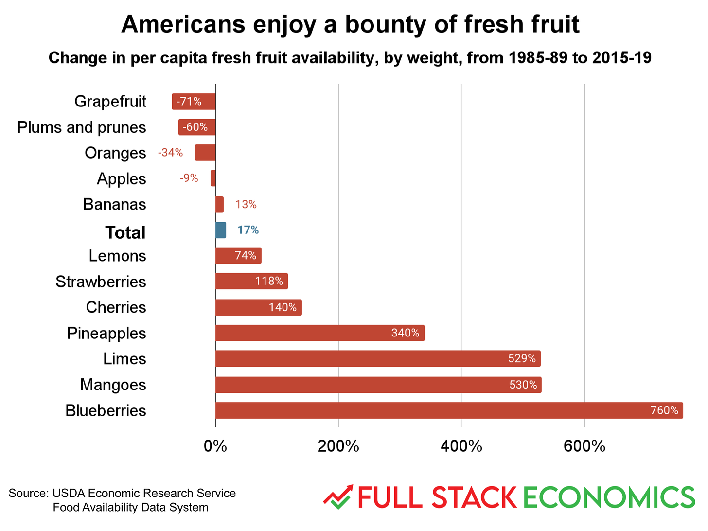
When I was a kid in the 1980s, people ate a lot of apples, bananas, and melons, as well as citrus fruits like oranges and grapefruit. I loved blueberries, strawberries, and cherries, but for most of the year they were very expensive if they were available at all.
Over the last 30 years, we’ve enjoyed a massive expansion in fresh fruit availability. Stores today stock about eight times as many blueberries, six times as many mangoes and limes, and four times as many pineapples as they did in the late 1980s. Strawberry and cherry availability has more than doubled.
Josh Barro wrote a great article back in 2014 explaining the berry boom:
Growers are planting better breeds of berry, with higher sugar content; they’re using pruning and growing techniques that extend the season, including growing berries inside greenhouse-like structures called tunnels that retain heat; and most important, they’re growing berries in places they didn’t used to, where production is possible at different times of year.
Historically, blueberries needed to be grown in regions that get cold weather for part of the year, because rising temperatures bring the plants out of dormancy. But newer “low-chill” blueberry varieties have helped make berries available all year by expanding production to formerly inappropriate areas like coastal California.
Berries still account for a fairly small portion of our overall fruit consumption. For example, we eat eight times more apples, by weight, than blueberries. But our fruit diets are more varied and delicious than ever before.
2. Veggies too
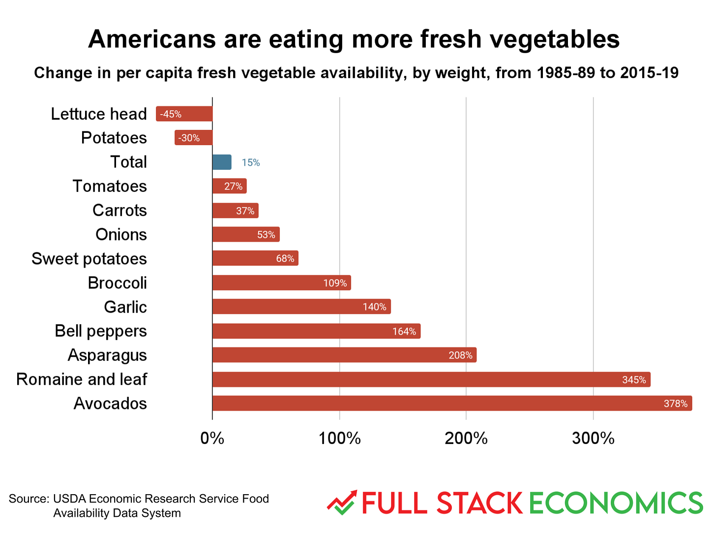
The story is the same for vegetables. In 1985, the four most popular vegetables in America were onions, tomatoes, lettuce heads, and potatoes—hardy vegetables that shipped and stored well. Today these veggies are still popular in absolute terms, but they’ve been losing ground to upstarts like avocados, asparagus, broccoli, and romaine lettuce. Overall, American stores stocked about 15 percent more fresh vegetables in the late 2010s than in the late 1980s.
The story is similar for meat but not quite as positive. Overall meat availability was up 11 percent between 1989 and 2018. But there was a big shift away from beef and toward chicken. Americans in 2018 ate 17 percent less beef and 60 percent more chicken than Americans in 1989. Pork was down 2 percent while seafood was up 3 percent. This may have been driven by shifting prices: inflation-adjusted chicken prices fell about 20 percent between 1989 and 2018. During the same period steak got 6 percent more expensive and ground beef got 27 percent more expensive.
3. Cheaper hammers, ladders, TVs, and more
The Spring/Summer 1980 issue of the Sears catalog offered a hammer with a fiberglass handle for $9.59. At the time, a typical worker made $6.86 per hour, so they needed to work about 1.4 hours to buy it. Today you can buy a comparable hammer from Amazon for $13.98. A typical worker today makes $27.33, which means they can buy a hammer after about 30 minutes of work—a 63 percent decline in work hours over 42 years.
I scanned through all 1,566 pages of that 1980 Sears catalog looking for items where it would be easy to make apples-to-apples comparisons like this. Almost every item I looked at saw significant declines in the hours of work required it buy it.
The most ridiculous example is the color TV. I picked the cheapest 25-inch television in the catalog, priced at $469.95 with no remote. Other 25-inch models went as high as $949.95 and came with a remote control and fancy oak, pine, or pecan cabinets. Modern flat-screen televisions, of course, are superior in many ways. And yet a similar-sized television today is a quarter the price even before you adjust for inflation.
I got the idea to look at old Sears catalogs from the Cato Institute’s Marian Tupy. I’ll use his underlying method—comparing growth in wages to growth in prices—for a bunch of the charts in this article. People often adjust past prices for inflation to see whether they’ve gone up or down over time. But there’s inherent subjectivity in inflation estimates, especially over long time periods. Directly comparing changes in wages to changes in prices eliminates much of that subjectivity and lets you, the reader, judge for yourself whether things are getting more affordable.
4. Cars got more affordable while trucks got more awesome
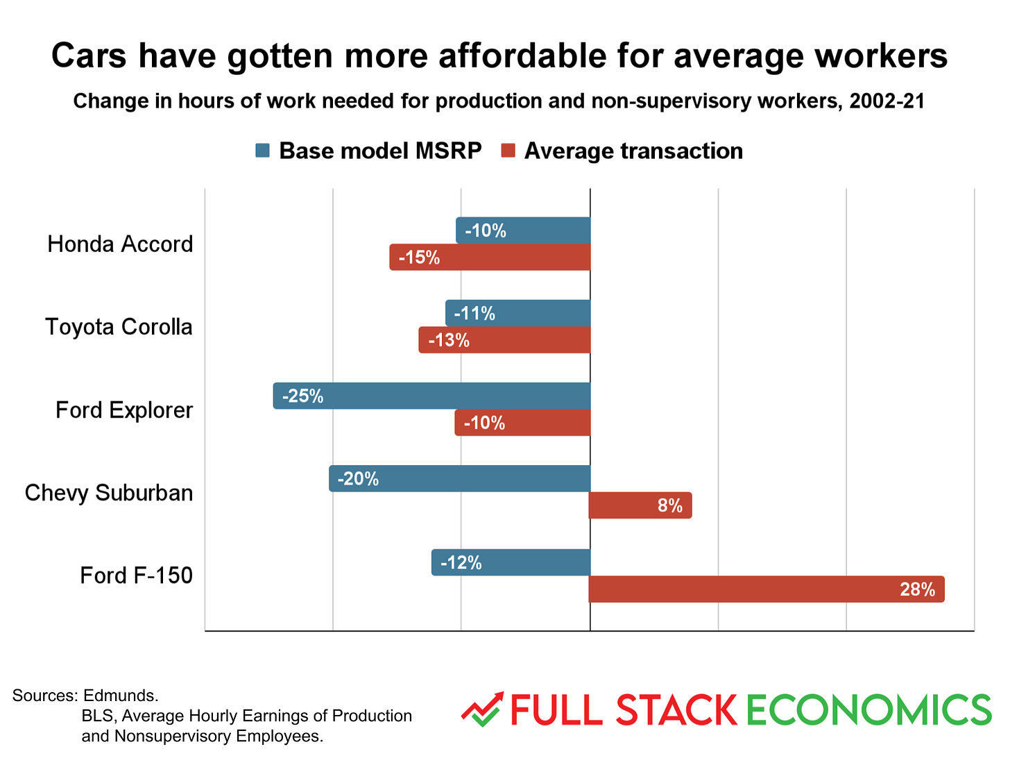
Edmunds, the online resource for car shoppers, supplied me with data showing how car prices have changed over the last 20 years. In 2002, the average selling price for a Honda Accord was $20,928.94. A typical worker in 2002 made $14.96 an hour and so needed to work for almost 1,400 hours to buy one. By 2021, the average Honda Accord cost $30,619.26. Average wages had risen to $25.90 per hour, allowing a typical worker to pay for a car with fewer than 1,200 hours of labor—a 15 percent reduction.
I asked Edmunds for data on five popular vehicles, and all five have had double-digit declines in the price of the base model since 2002. The average actual selling price across all trim levels has also been falling for the Accord and the Toyota Corolla.
But American consumers have been spending more than ever on SUVs and pickup trucks. Jessica Caldwell, a car industry expert at Edmunds, told me that pickup trucks in particular have changed dramatically over the last 15 to 20 years. They used to be more utilitarian, she said, with a lot of people buying them to haul stuff for work. But “particularly over the past 15 years, they’ve turned into more of a family hauler,” she said. Four-door trucks have increasingly replaced two-door models, and modern trucks have more creature comforts.
5. More powerful and efficient
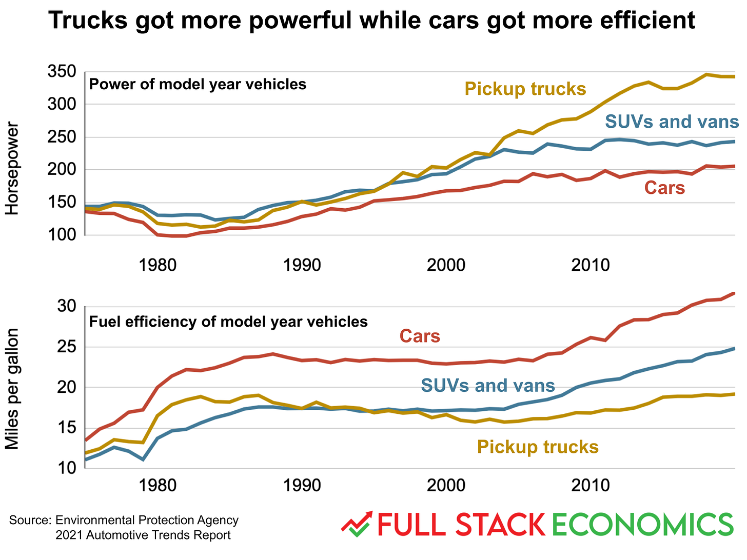
When you’re designing an internal combustion engine, there’s a basic tradeoff between fuel efficiency and engine power. The makers of passenger cars and pickup trucks have pushed this tradeoff in opposite directions. Pickups trucks have gotten a lot more powerful over the last 45 years, while cars have gotten a lot more fuel efficient.
Still, even with their much greater power, pickup trucks are more fuel-efficient today than in the early 1980s. And even with their much greater fuel efficiency, cars today have more powerful engines.
6. Cars are getting safer
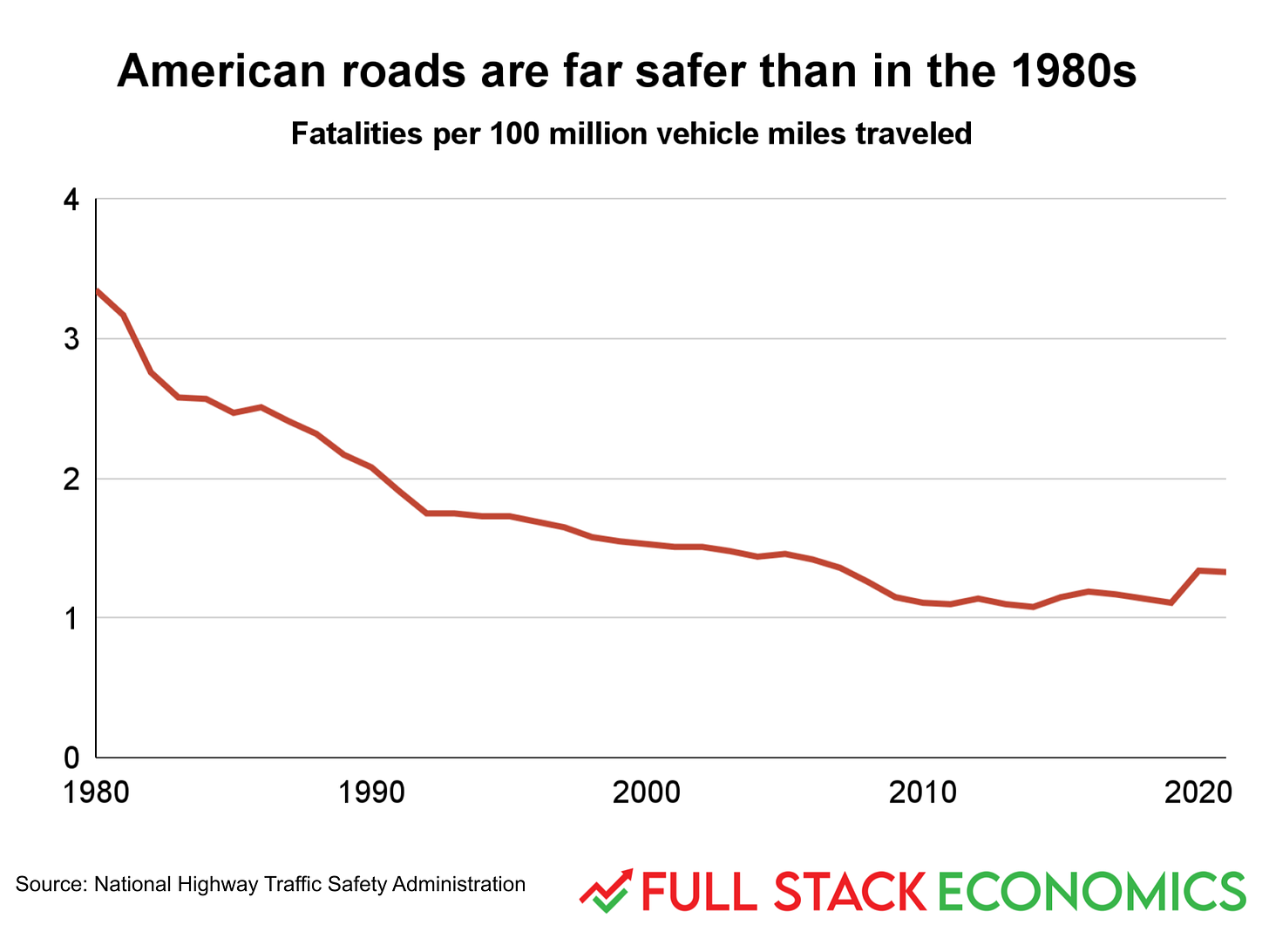
In 1980, America suffered 3.35 highway fatalities for every 100 million miles on the road. In 2014, it reached an all-time low of 1.08 fatalities per 100 million miles. In 2021 the figure was 1.33 deaths per 100 million miles—worse than 2014, but still much better than a generation ago.
A number of non-economic factors have contributed to this progress, including better highway designs and changing norms and laws about drunk driving. But a key factor has been that vehicles themselves are getting safer. Airbags and antilock brakes have become standard equipment. Car bodies have been redesigned with crumple zones and other features that reduce the probability that a high-speed crash will be fatal.
7. Changing consumption patterns
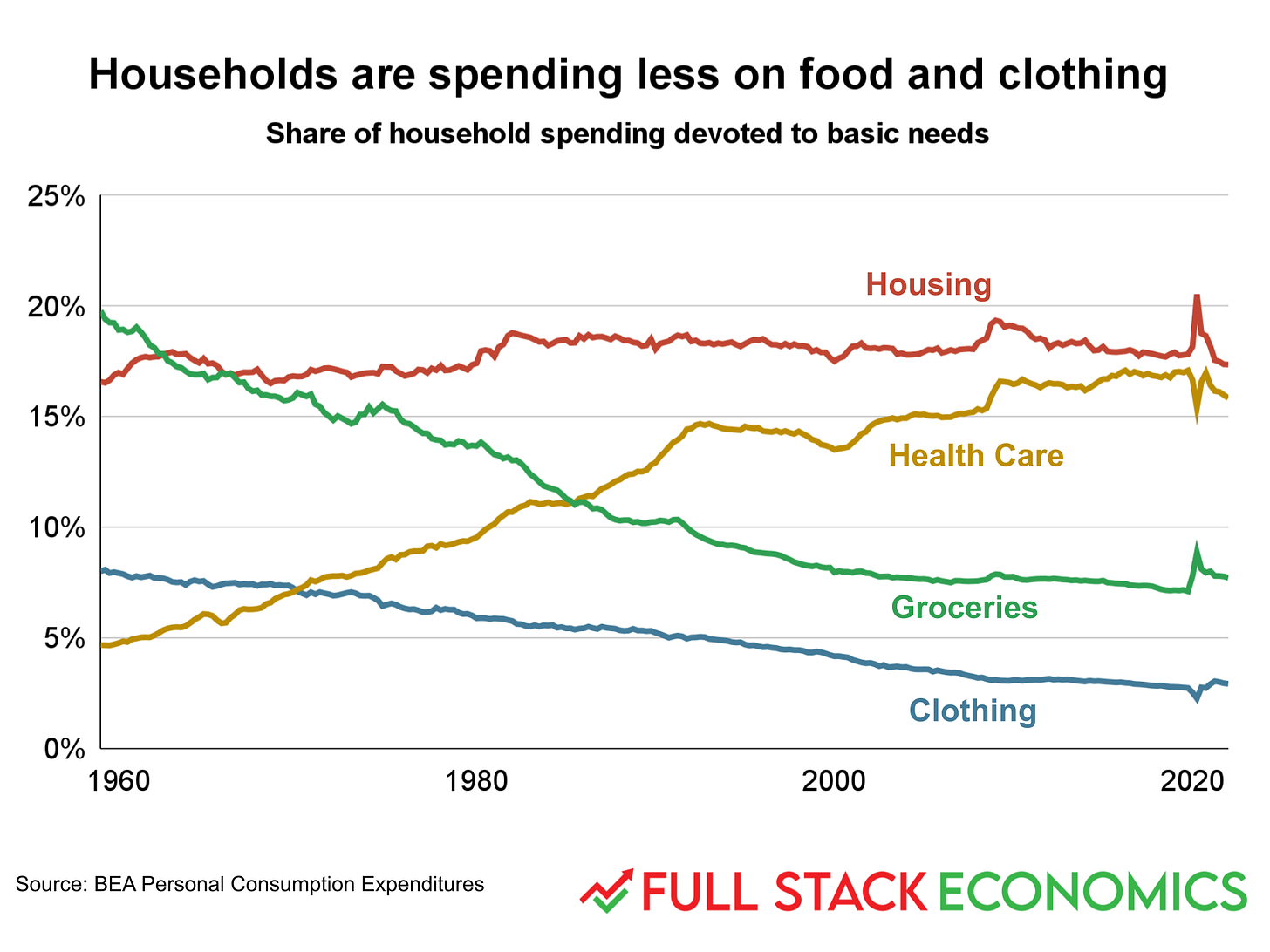
Let’s zoom out and look at the big picture. In 1960, the average American household spent 28 percent of its income on food and clothing. By 1990, the figure had dropped to 15 percent. Today it’s 11 percent. This isn’t because people have been buying less food or clothing. Rather, people’s incomes have grown faster than the cost of food and clothing, and people spent the extra money on other categories.
Much of the slack has been taken up by health care, which rose from 5 percent of household budgets in 1960 to 16 percent today. A big question here is whether consumers are getting more value for this extra spending—we’ll explore this a bit in subsequent charts.
Spending on housing hasn’t changed much at all—it was 17 percent in 1960, 18 percent in 1990, and 17 percent in early 2022.
8. One of these lines is not like the others
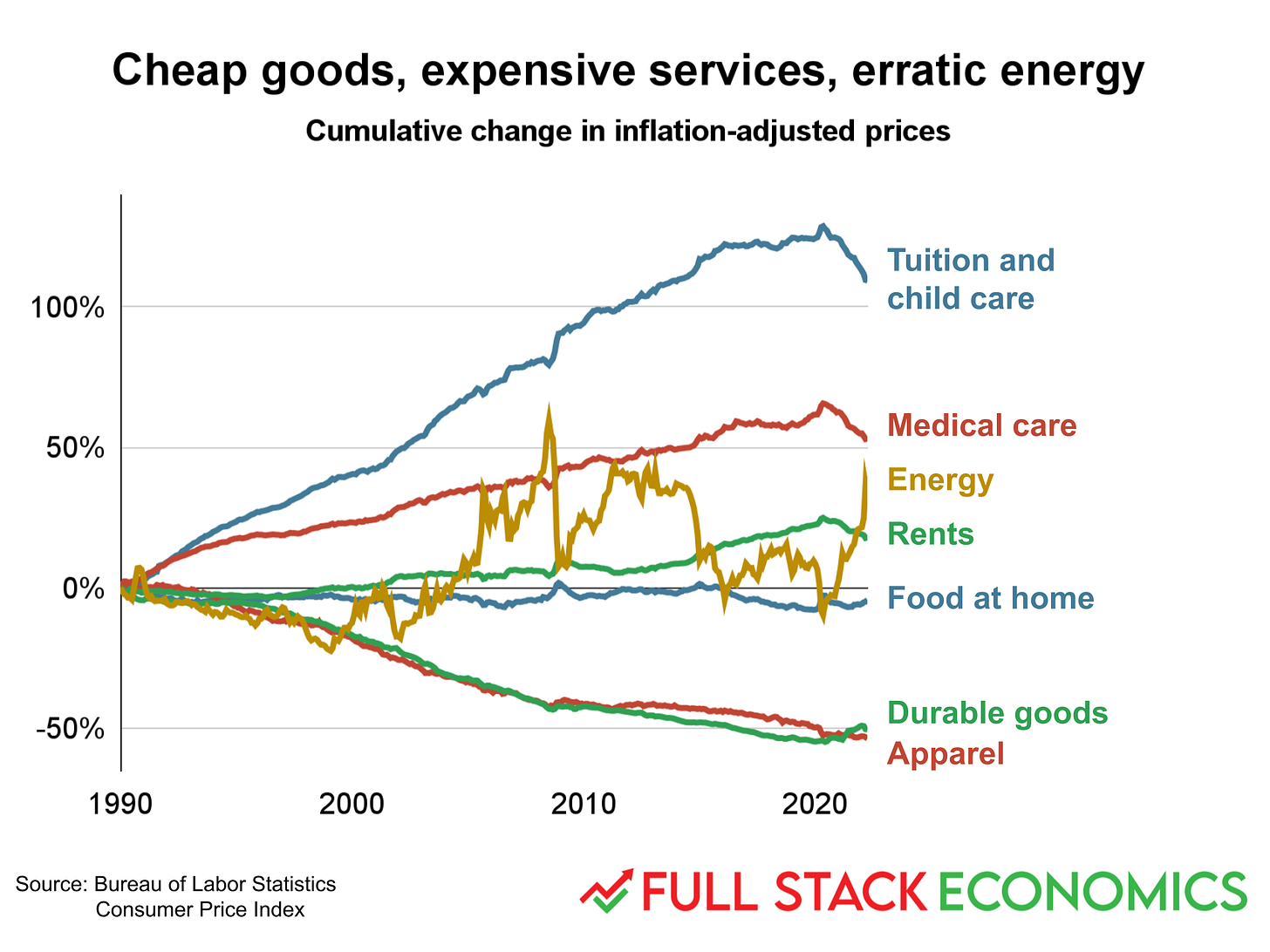
Here I created a variant of a chart that’s been popularized by AEI’s Mark Perry, and that I used in my January piece “18 charts that explain the American economy.” As you can see, clothing and durables—that’s cars, home appliances, and other long-lasting consumer goods—have been getting cheaper rapidly, while health care and education have tended to get more expensive over time. Food and rent are in the middle.
Energy costs have bounced around like crazy, and this is the most important factor driving inflation right now. Energy costs have increased 30 percent just over the last year, which accounts for a significant chunk of the 8.6 percent overall inflation rate. Yet over the longer run, fluctuations in gas prices don’t have a very big impact on the cost of living. Energy costs were about the same (adjusted for inflation) in 1990 and 2020. There were just a lot of ups and downs in between.
9. Comparing wage growth to the cost of necessities
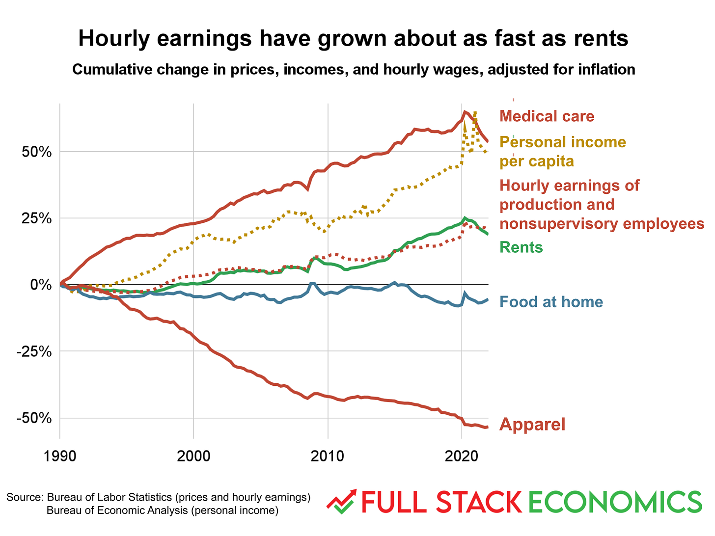
Here I compare the four necessities of life—clothing, food, shelter, and medical care—to changes in average incomes over time. Throughout this piece, I’ll focus on the hourly earnings of production and nonsupervisory employees, a statistic published by the Bureau of Labor Statistics that excludes the incomes of business executives. I think this is a good proxy for the earning power of average workers.
As you can see, food and clothing have gotten more affordable for average workers over the last 30 years. The cost of shelter has risen at about the same rate as average wages, while medical care has gotten more expensive relative to wages.
I’ve also included personal incomes per capita, a broader measure that includes the salaries of high-earning executives as well as investment income that flows mainly to the wealthy. Unsurprisingly, this measure of income has risen much faster than the wages of ordinary workers.
10. Policy changes have helped low-earning Americans
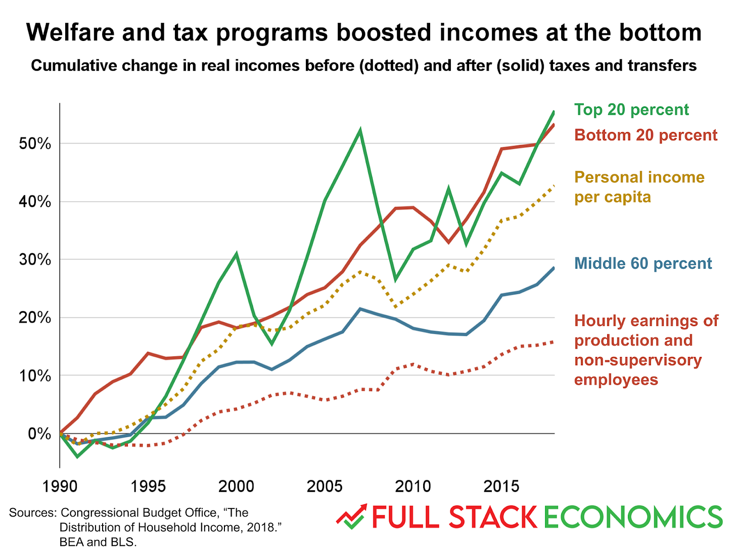
The previous chart focused on pre-tax market income. But people’s standard of living is also affected by taxes and government benefits. Last year the Congressional Budget Office crunched the numbers and found something surprising: once you account for changes to tax and transfer programs, people in the bottom quintile of market income enjoyed the biggest gains between 1990 and 2018. (The CBO used the PCE inflation index. For consistency with my other charts, and to be charitable to economic pessimists, I’ve switched to the better-known consumer price index, which tends to show higher inflation, and hence slower wage growth.)
Several factors have contributed to the rising living standards of those at the bottom. Probably the most important is the increase in health care subsidies. In 1990, the bottom quintile of Americans received Medicaid benefits that were worth 17 percent of their incomes. Then Congress created the Children’s Health Insurance Program in 1997 and Obamacare expanded Medicaid in 2010. These and other factors increased health care subsidies to 45 percent of bottom-quintile incomes by 2018.
That’s not all. The value of refundable tax credits—including the Earned Income Tax Credit, the Child Tax Credit, and education tax credits—rose from 2 percent of bottom-quintile income in 1990 to 13 percent in 2018. These refundable tax credits became generous enough that the average bottom-quintile family paid no federal taxes, on net, in 2018, down from 10 percent in 1990.
All of which is to say that the 16 percent increase in average non-supervisory wages between 1990 and 2018 understates the actual gains of low-income workers.
11. Household appliances are becoming ubiquitous
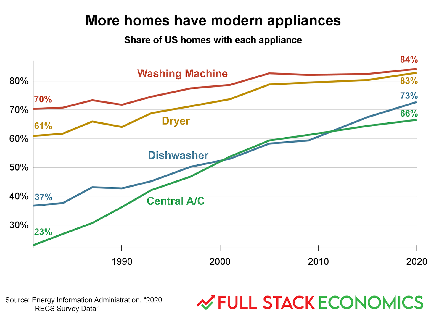
The share of households with a full suite of modern appliances has steadily increased over the last 40 years. A key reason is affordability.
In 1980, the cheapest dishwasher in the Sears catalog went for $299—$1,068 in today’s dollars. Today the cheapest dishwashers at Best Buy or Home Depot sell for around $400. The cheapest Sears washing machine in 1980 went for $219—$783 in today’s dollars. Today, washing machines with more features start around $500.
12. The McMansion boom
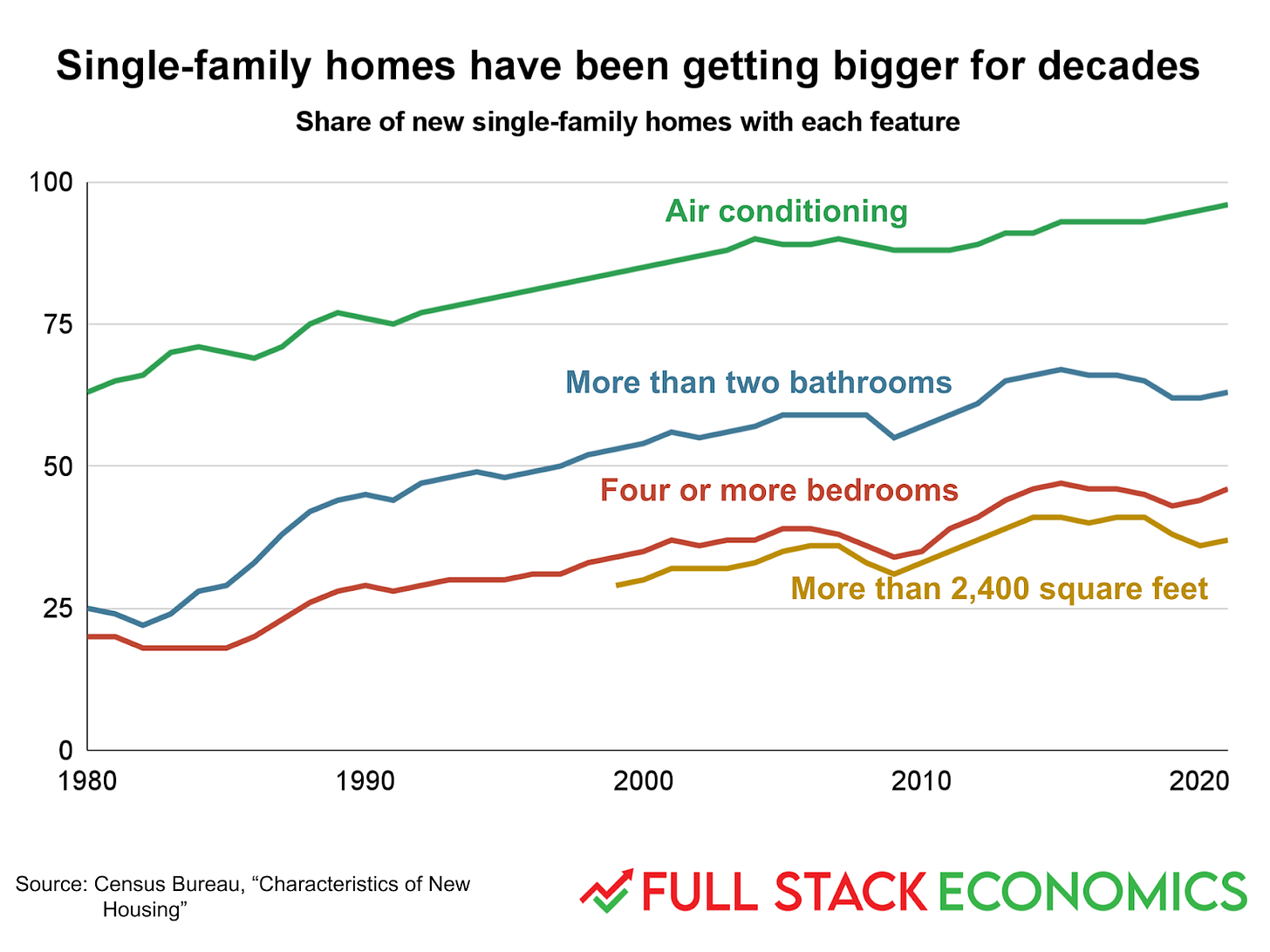
In 1990, only 20 percent of new single-family homes had four or more bedrooms. In 2021, it was 46 percent. Over the same period, the share of homes with more than two bathrooms rose from 25 percent to 63 percent.
Progress on air conditioning has continued apace. But growth in the physical size of homes has slowed. The share of homes larger than 2,400 square feet only rose from 36 percent in 2007 to 37 percent in 2021.
13. Apartments are getting smaller
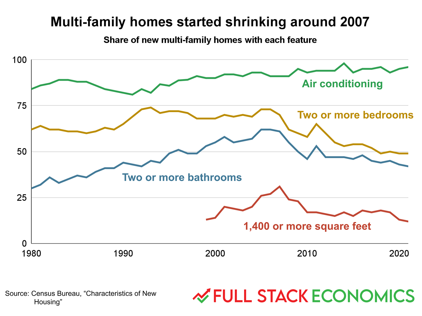
While growth of single-family homes has slowed, homes in multi-family developments have actually gotten smaller over the last 15 years. At the 2007 peak, 31 percent of new homes in multi-family buildings were larger than 1,400 square feet. That figure has plunged to 12 percent. The share of new apartments with more than two bedrooms or bathrooms has also declined.
Another striking thing about this chart is the convergence between the “two or more bathrooms” and “two or more bedrooms” measures. Having bedrooms is mostly a function of floor space—the larger the overall apartment is, the more bedrooms it can have. Bathrooms take up much less space, but require extra work to install plumbing and fixtures. So as we’ve grown wealthier but more space-constrained, we’ve used the space we have more intensively, with more household appliances and more bathrooms per square foot.
14. Homeownership has gotten more affordable (really)
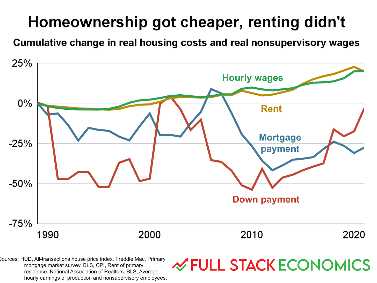
In the first quarter of 1989, the median home sold for $118,000—that’s $285,000 in today’s dollars. Today the median home sells for $429,000, a 50 percent increase in inflation-adjusted terms. This has caused a lot of people to conclude that homes have gotten less affordable over the last 30 years.
But this misses something important: most homes are purchased with borrowed money. And the average rate on a 30-year mortgage has declined from 10.8 percent in 1989 to 5.8 percent today. As a result, the mortgage payment on a median-priced home is significantly lower today than it was in 1990—even after the recent run-up in mortgage rates.
You might object that this doesn’t help someone if they can’t scrape together the downpayment required to buy a home at today’s high prices. But down payment requirements have gotten looser too! According to the National Association of Realtors, the average homebuyer in 1989 put 20 percent down. In 2021, it was 13 percent. So the average downpayment is a bit smaller today, in inflation-adjusted terms, than it was in 1989.
15. A tale of 10 cities
My claim that housing hasn’t gotten less affordable might surprise you, especially if you live in a big, expensive city like San Francisco, New York, or Los Angeles. This chart helps to explain why there’s such a mismatch between the national data and perceptions in some metro areas.
This chart uses the per capita personal income metric published by the Bureau of Economic Analysis because it was the only income or wage data I could find that was broken down by metropolitan area. As we saw in chart 8, per capita personal income has grown a lot faster than average hourly wages because it includes investment income and the pay packages of business executives. So you shouldn’t read too much into the fact that the yellow bars in this chart are all longer than the red bars.
But the chart shows that there is only a weak correlation between a metro area’s income gains and its rent hikes. Some cities with nice weather, including Honolulu and Los Angeles, have had large rent increases since the 1980s despite modest income gains. Others—like Philadelphia and Minneapolis—have seen much smaller rent increases coupled with strong income gains. Then there’s St. Louis, which had below-average income gains but actually saw rents fall over.
16. Every age group is less vulnerable to heart disease
We saw in Chart 7 that medical care costs have been rising faster than overall inflation over the last 30 years. But this fact comes with an important caveat: the Bureau of Labor Statistics doesn’t even try to adjust health care inflation statistics for quality the way they do for cars and televisions. So these numbers don’t tell us what we really want to know: whether we’re getting more value for all the extra money we’re spending on health care.
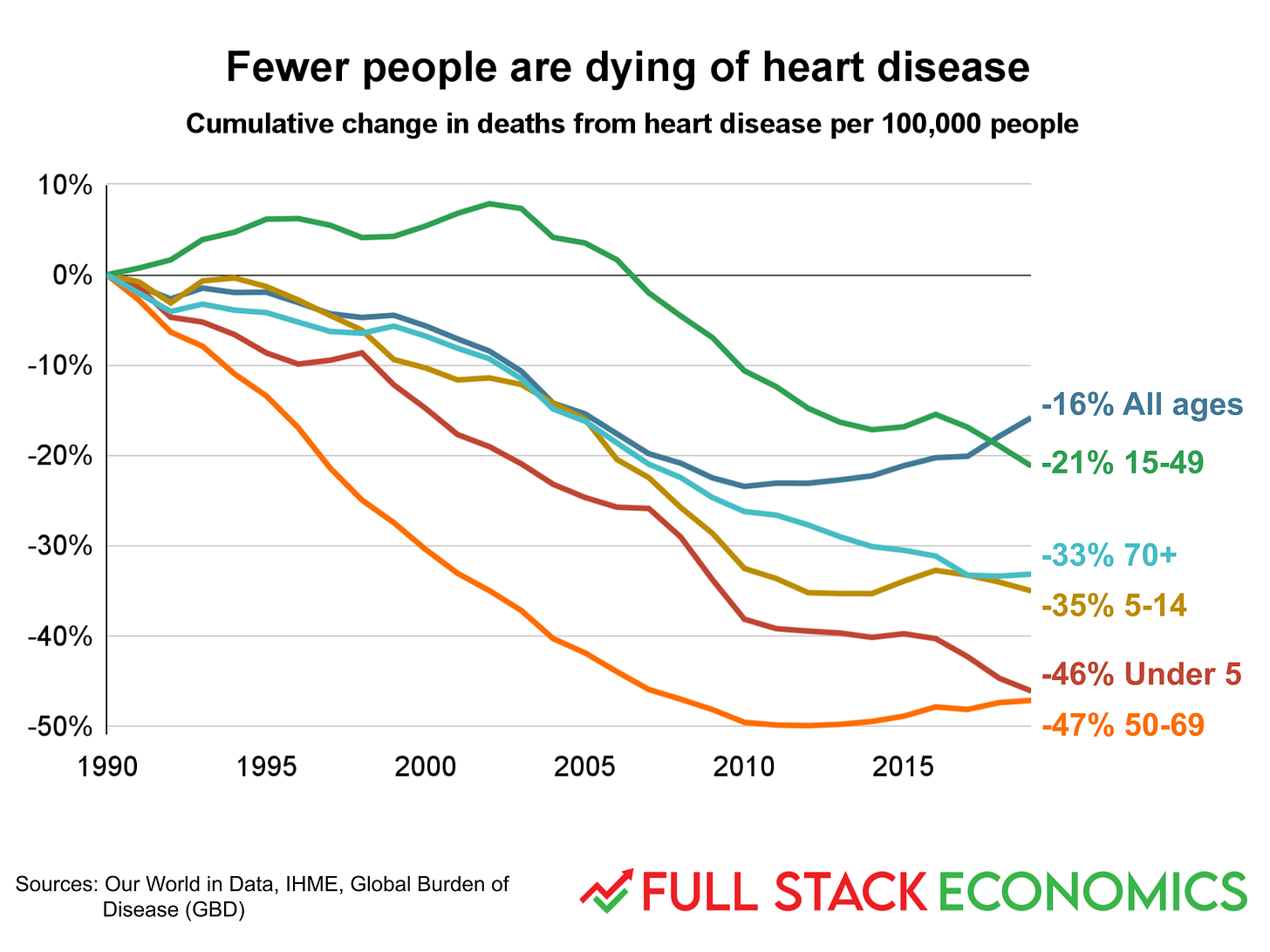
I’m not going to settle that debate with a few charts, but here’s one example of why the official inflation statistics might not properly account for the rising quality of health care. It shows survival rates for heart disease, one of the leading killers of older Americans. As you can see, people in every age group are less likely to die of heart disease, in any given year, than they were in 1990.
The chart also illustrates a statistical paradox: the all-ages death rate has been improving more slowly than any individual age bracket. The reason for this is simple: as we live longer, more and more Americans are aging into the 70+ age bracket, putting them at much higher risk.
17. More Americans are surviving cancer
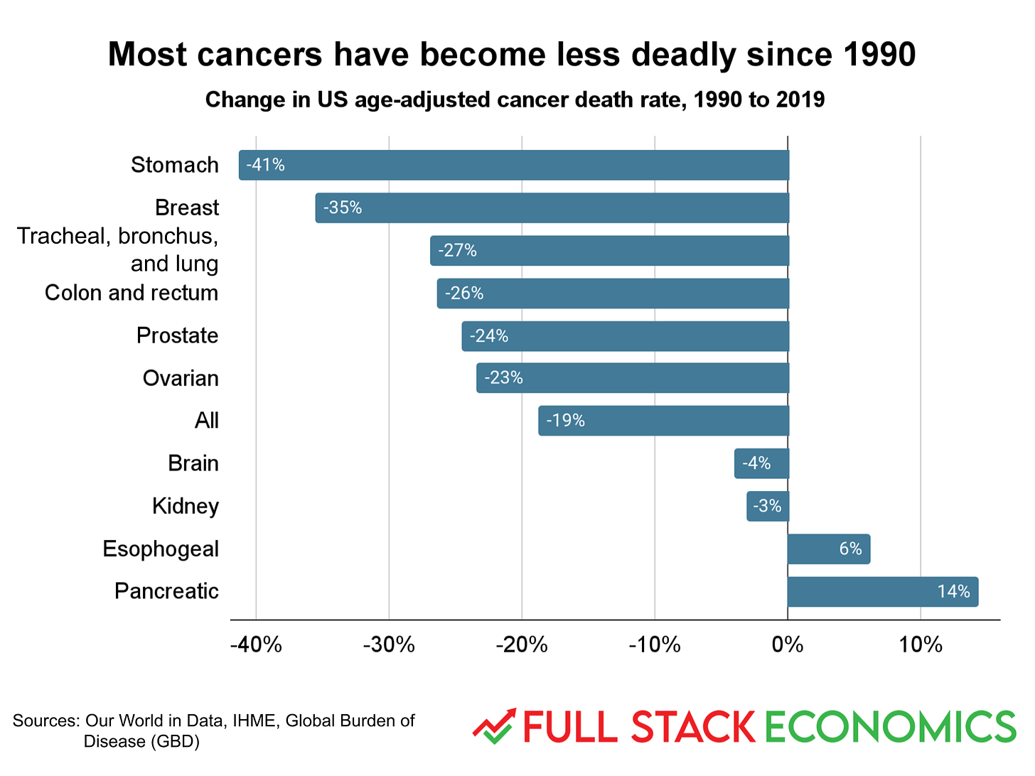
Another top killer of older Americans is cancer. And here too the trends have been positive. America’s deadliest cancer is tracheal, bronchus, and lung cancer. Its age-adjusted death rate declined 27 percent between 1990 and 2019. That might be partly because of reduced smoking. But other common cancers—including breast, colon, and prostate cancer—have had similarly large declines.
This chart doesn’t include the one (fairly rare) cancer that has seen a big increase: deaths from liver cancer were up by 112 percent. But overall, your odds of dying of cancer at any given age is about 19 percent lower than it would have been 30 years ago. And it seems likely that medical advances deserve much of the credit. (Thanks to Jeremy Horpedahl for suggesting this chart.)
18. More Americans than ever have health insurance
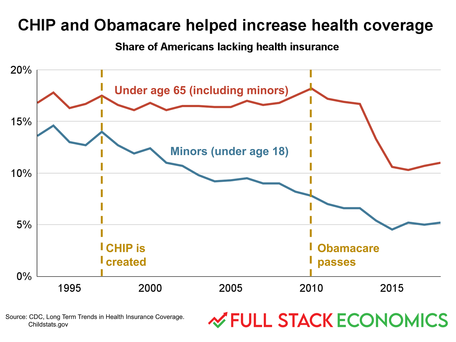
Better medicine doesn’t help you if you can’t afford it, which is what makes this chart so important. It shows the share of non-elderly Americans who have health insurance. For the population as a whole, the big event was the 2010 passage of Obamacare, which expanded Medicaid and also offered subsidies for those who purchased health insurance through the newly-created exchanges.
Access to health care for children was already improving prior to Obamacare, thanks in part to the Children’s Health Insurance Program (CHIP), which was first created in 1997.
19. College is getting more expensive
Most of my charts so far have accentuated the positive, but there’s no way to sugar-coat this one: tuition is a lot higher than it was 40 years ago. This is especially true for four-year colleges, which are almost three times as expensive as they were in 1980. Prices for two-year colleges doubled over the same period.
20. Lots of people complete college despite the high costs
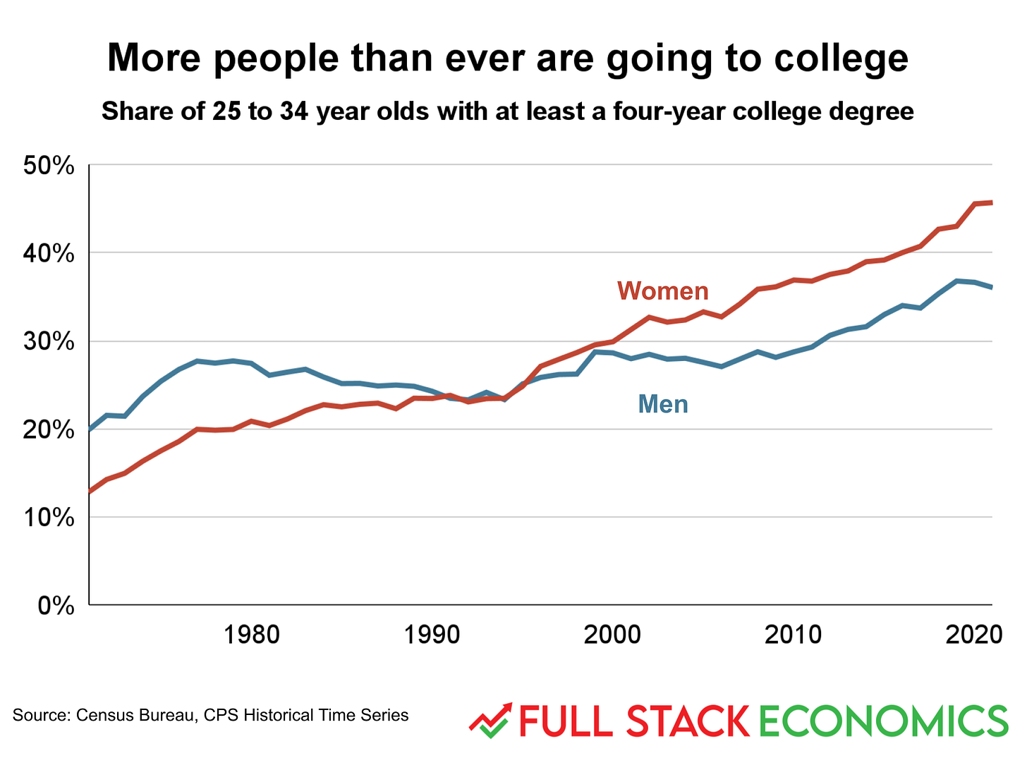
Despite the rising cost of college, more and more young people are earning bachelor’s degrees. The trend is particularly striking for women. In 1971, 13 percent of young women over 25 had college degrees. In 2021, it was 46 percent.
In the most literal sense, then, college continues to be affordable: more and more people are, in fact, managing to afford it. One reason for this is that college students hail disproportionately from the upper half of the income distribution. Many of these families have enjoyed strong income gains and are willing and able to pay a premium to ensure their children get a great education. But that can push up costs for everyone else.
21. Hands-on parenting
Many people believe the demands of modern life make it increasingly difficult for parents to spend enough time with their kids. But survey results show that this isn’t just wrong but backwards: parents today spend far more time with their kids than parents did 30 or 40 years ago.
In 1985, the average mother spent 8.5 hours per week focused on child care, while the average father spent 3 hours. Today mothers spend 13.7 hours, while fathers spend 7.2 hours.
22. Non-college workers retire earlier than college graduates
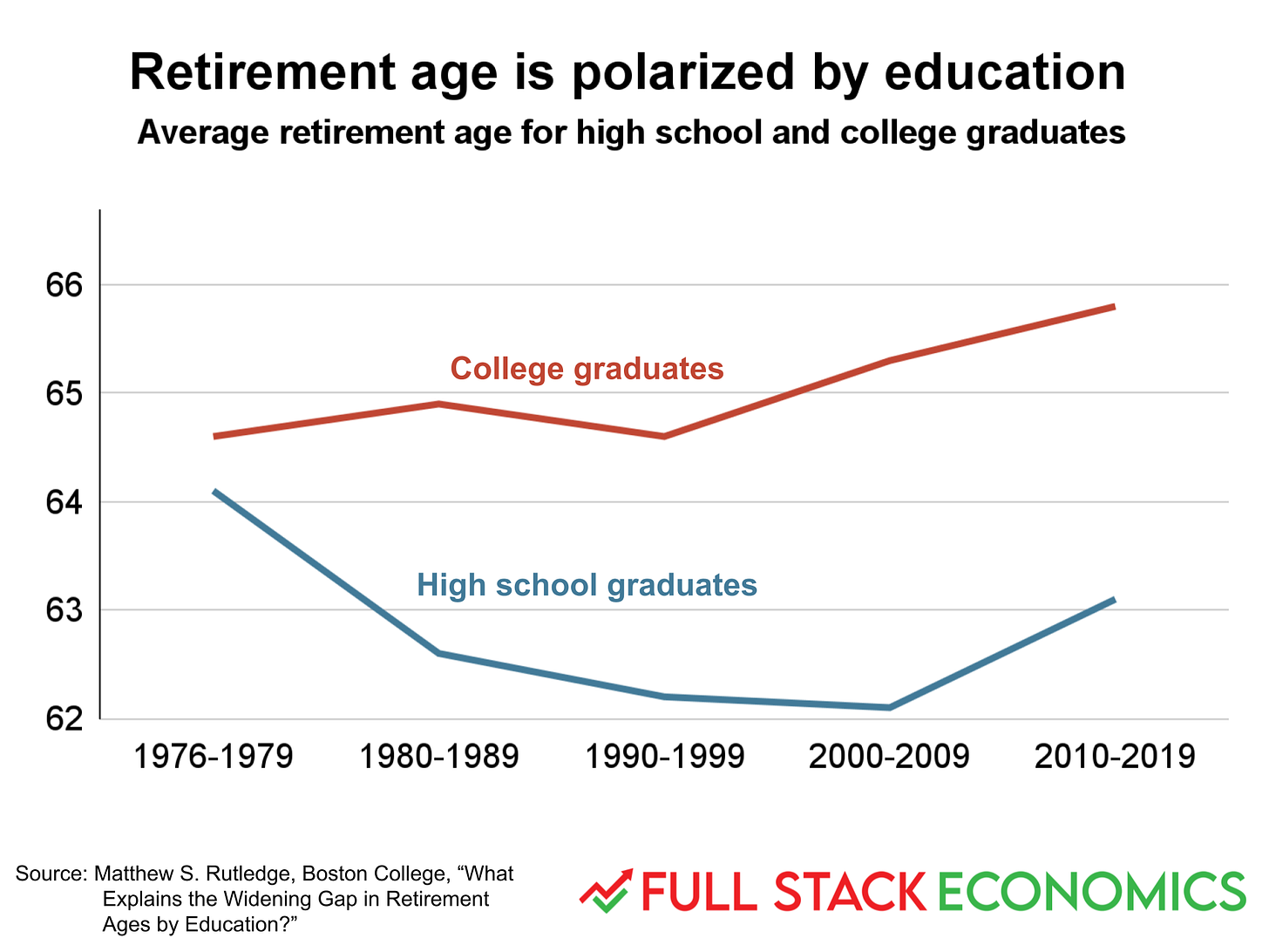
In the late 1970s, high school graduates and college graduates both retired around age 64. But over the last 40 years, these groups diverged—and not in the direction you might expect. Workers without a college degree kept retiring earlier, while college graduates started retiring later. Then in the 2010s, both groups started retiring later.
You could take this as a sign that living standards have been going backwards. But the fact that the late retirement trend started with college graduates makes me skeptical of that interpretation. College graduates make significantly more money over their careers, so if delayed retirement was driven by financial constraints you’d expect later retirements by non-college workers.
Another possibility is that as life expectancies increase and many jobs become more enjoyable, people are voluntarily deciding to keep their jobs a few more years.
23. What about carbon emissions?
A significant downside to America’s high standard of living is our carbon emissions, which are raising global temperatures and threatening to reduce the living standards of our grandchildren. There is still a lot of work to be done to reduce carbon emissions in the US and around the world. But this charts shows that things are moving in the right direction. The carbon intensity of the US economy has improved by almost 50 percent since 1990.
24. Batteries keep getting cheaper
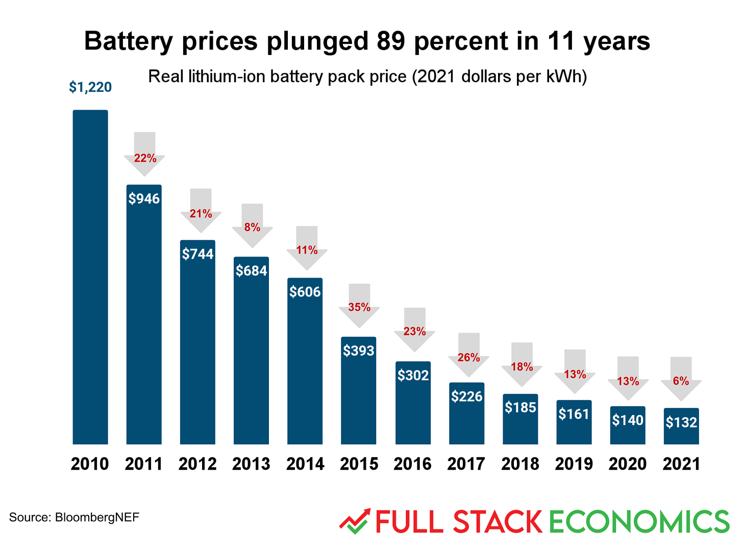
No technology is more important to the next phase of decarbonization than lithium ion batteries. Large batteries are essential for electric vehicles, and even bigger batteries will be needed for grid storage systems to buffer the intermittent power generated by solar panels and windmills. And happily, there’s been a stunning decline in lithium ion battery costs—from $1,220 per kWh in 2010 to $132 in 2021.
Cheap lithium batteries are transforming other industries too. They have enabled a new generation of e-bikes, driven a shift toward electric lawnmowers, leaf blowers, and weed whackers, and aided the growth of the drone industry. Ultimately, cheap batteries will mean our cities are quieter, safer, and have cleaner air.
Thanks to Aden Barton for research, graphics, and editing help with this story. Thanks to Jeremy Horpedahl for inspiring several of these charts. His post on Homer Simpson and home prices is worth a read. Finally, thanks to Cato’s Marian Tupy, whose website humanprogress.org is an essential source of optimistic takes on the world economy.


