14 charts that explain America’s inflation mess
The US has its biggest inflation problem in 40 years.
Last week, the US got another bad inflation report. The headline annual inflation rate declined from 8.5 percent to 8.3 percent, driven by the plunging cost of gasoline. But core inflation—a measure that excludes volatile food and energy prices—rose from 5.9 percent to 6.3 percent, signaling that the nation’s inflation problems are far from over.
In this article we’ll use charts to explore the many facets of America’s inflation mess. We’ll examine the forces that caused prices to shoot up last year, and look at how those increases have played out in different sectors across the economy.
1. Median inflation is at its highest level in decades
The volatility of food and energy prices creates a dilemma for economic policymakers at the Federal Reserve and elsewhere. The prices of food and energy commodities are largely set by global markets. To keep the headline inflation rate at 2 percent during a period of surging oil prices, the Fed would need to engineer deflation—and most likely a recession—in other sectors of the economy. So economists like to focus on “core” inflation—a measure which strips out food and energy prices.
Tossing out food and energy is a bit arbitrary, though, so the Cleveland Fed also publishes a statistic called median CPI that aims to accomplish the same goal in a more rigorous way. The Cleveland Fed ranks goods and services from the highest inflation rate to the lowest (each item is weighted by consumer spending), then picks the item in the middle of the pack. As you can see from the chart, the median CPI does a good job of filtering out noise by ignoring items that have the highest and lowest inflation rates at any point in time, whether it’s gasoline, beef, used cars, or anything else.
The median CPI has been steadily rising over the last year, and it’s now at its highest level in decades. That’s worrying because it means today’s high inflation is not being driven by a handful of outlier categories like gasoline or used vehicles. Fully half the products consumers buy saw prices rise by more than 6 percent over the last year.
2. The pandemic scrambled the inflation picture
People talk about “the” inflation rate, but different products get more expensive at different rates. Before the pandemic, the pattern was fairly consistent from year to year. The prices of labor-intensive services (like education and health care) tended to rise faster than average, while manufactured goods (like clothing and cars) had below-average inflation rates.
The pandemic changed everything. The combination of surging demand and supply-chain disruptions caused the prices of food and cars to rise much more rapidly. On the flipside, college tuition, which had already been slowing for demographic reasons, has fallen well behind overall inflation in the last two years.
The most dramatic change has been the cost of gasoline. Gasoline prices, always volatile, had been falling in the five years before the pandemic. Since COVID hit, gasoline prices have exploded, averaging 14 percent annual inflation over the last three years.
3. Rent inflation is baked in for the next year
The last chart showed an annual shelter inflation rate of 3.8 percent over the last three years. If you’ve been paying attention to the housing market, that probably sounds too low to you.
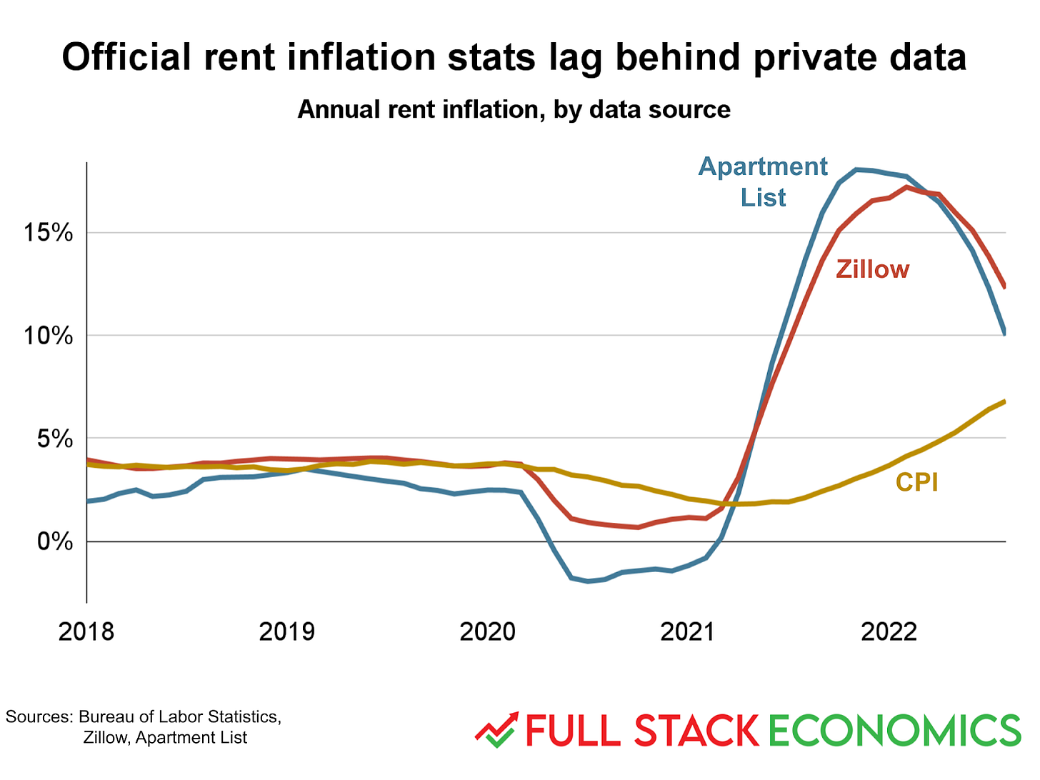
This chart helps to explain what’s going on. The Bureau of Labor Statistics (BLS) says rents rose by 6.8 percent over the last year. But private data from Zillow and Apartment List show much higher figures—10 and 12 percent, respectively. The gap was even bigger in early 2022.
So who is right? Actually they both are—they’re just measuring different things. Zillow and Apartment List are tracking how much you’d have to pay if you signed a new lease today. These “spot rents” have been rising rapidly over the last 18 months.
In contrast, the BLS tracks how much the average renter actually pays. Because most renters have year-long leases with fixed rents, it takes about a year for an increase in spot rent to be felt across the rental market. So today’s high spot rents mean that the official shelter inflation rate is very likely to remain high for at least another year.
4. This is what an overheated job market looks like
A good way to understand the labor market is to compare the number of unemployed workers to the number of job openings. For most of the last 20 years, the unemployment rate (unemployed workers divided by total workers) was dramatically higher than the vacancy rate (open jobs divided by total workers). This isn’t a great situation for workers, since even those who have jobs have little bargaining power.
In a recent paper, the economists Pascal Michaillat and Emmanuel Saez argued that parity between unemployment and vacancies was a good benchmark for a healthy labor market. The US reached this point in 2018. Unfortunately this only lasted for a couple of years before COVID struck, throwing millions of people out of work.
Over the last 18 months, for the first time in decades, we have the opposite problem: far more open jobs than available workers. While this has obvious benefits for workers—it gives them strong bargaining power—it also has downsides. It means businesses are chronically understaffed and unable to operate at full capacity. That, in turn, produces shortages that ultimately drive inflation.
5. The stimulus put money in people’s pockets
Between May 2020 and March 2021, Congress passed a series of three stimulus bills that left a lot of households flush with cash. Many economists credit the first stimulus, in May 2020, with helping to end that year’s deep but very short recession. But the second and (especially) the third stimulus bills seem to have gone too far, goosing the economy so much that demand outstripped supply. As a result, prices started to rise in mid-2021.
Congress hasn’t passed any more major stimulus bills since March 2021, but the lingering effects of the earlier stimulus spending are evident in household financial data provided to me by the JPMorgan Chase Institute. Both high- and low-income households still have about 50 percent more cash in their checking accounts than they did three years ago.
6. Why 2020 worked out differently than 2008
In the final months of 2008, the Federal Reserve flooded the economy with cash in an effort to contain the financial crisis. The monetary base—a term that includes physical cash as well as the “virtual cash” banks deposit at the Fed—doubled between August 2008 and April 2009. While this doesn’t look like a very big jump in the top panel of this chart, it seemed like a huge increase for a time, and it caused many people (including me) to worry it would trigger high inflation.
In normal times, having more deposits with the Fed (known as “reserves”) would allow banks to issue more loans to the public. The result is a multiplier effect, where each dollar of reserves leads to several dollars of additional bank deposits held by the public.
But in the depressed economy of 2009, banks weren’t interested in lending out more cash. So the extra reserves mostly sat idle on bank balance sheets. You can see the result in the bottom panel, which shows a broader measure of money called M2 that includes checking accounts, savings accounts, and money market mutual funds. The amount of money held by the public didn’t rise an unusual amount in 2008 or 2009, and if anything we had too little inflation in this period.
The Fed did something similar in 2020: it boosted the monetary base from $3.4 trillion in February 2020 to $6 trillion in April 2021. While this was a similar-sized change in percentage terms, you can see in the bottom chart that it had a much bigger impact on the broader money supply. M2 jumped by about 15 percent between February and May 2020, and then continued growing at a faster-than-normal pace thereafter. A big reason for this was that Congress did much more stimulus spending. As a result, a lot of the newly-created money went to people inclined to spend it.
7. The COVID stimulus bills boosted incomes a little too much
The flat-footed policy response to the 2008 crisis allowed real incomes and spending fell far below the pre-2007 trend. In effect, we lost trillions of dollars in wealth that would have been created with better macroeconomic policies.
When the COVID pandemic hit in 2020, leaders in Congress and at the Fed were determined not to make the same mistake. So we got more decisive Fed action—they cut rates to zero almost immediately, for example—as well as a series of three stimulus bills that were collectively much larger than Obama’s stimulus. As a result, incomes were temporarily pushed far above their pre-2020 levels. That boosted spending and helped the economy recover rapidly to pre-pandemic levels of output and consumption.
Unfortunately, this spending was so strong that we wound up with high inflation that eroded the real purchasing power of everyone’s incomes. So while incomes are higher than ever in nominal terms, inflation-adjusted incomes have actually fallen behind the pre-2020 trend.
8. The case for targeting nominal spending
While the last chart looked at inflation-adjusted incomes and spending, this one looks at economic output in nominal terms—that is, not adjusted for inflation. I think this provides the clearest picture of what went wrong in both 2008 and 2020.
In 2008, policymakers let gross domestic product fall well below its previous trend, leading to years of high unemployment and lost economic output. In the COVID era, US policymakers made the opposite mistake, pushing up spending (and hence nominal GDP) far above the pre-2020 trend line. It’s not possible for real economic output to grow that quickly, so inflation was the predictable result.
Some economists argue that rather than targeting 2 percent inflation, the Fed should target steady and predictable growth of nominal output. If the Fed had done this, it might have avoided the mistakes of both 2008 and 2020.
9. A durable goods spending spree
Here’s a more concrete way to illustrate the difference between 2008 and 2020. In the wake of the 2008 financial crisis, consumers felt financially squeezed, and they responded by cutting back spending on durable goods like cars, furniture and household appliances. Over the following decade, spending on durable goods never returned to the pre-2008 trend.
The situation in 2020 was the opposite. Spending on durable goods plunged in the first few weeks of the pandemic. But once it became clear that the economy wouldn’t collapse and that people would be cooped up in their homes for a while, spending on durable goods soared to new heights. Meanwhile, spending on services recovered much more slowly as the pandemic hampered the re-opening of the economy.
10. Pay attention to the red line
For a quarter century before 2020, services tended to have above-average inflation rates, while the cost of durable goods fell every year. Then that suddenly changed, with the inflation rate for durable goods shooting up from negative 2 percent in 2019 to 10.6 percent in 2021.
In 2022, durable goods inflation finally started to come back down. The problem is that services inflation is still rising. And while the rise in services inflation isn’t as dramatic—it rose from 2.2 percent in 2019 to “only” 4.6 percent over the last 12 months—services account for 60 percent of consumer spending, compared to just 13 percent for durable goods. So that seemingly small uptick in the red line has a big impact on the overall inflation rate.
11. The global context
A bunch of countries are struggling with inflation right now. The US is a bit higher than average but is not an outlier. Some Democrats have argued that high inflation rates abroad show that US policies—especially the March 2021 American Rescue Plan—are not to blame for America’s high inflation.
This is unconvincing for a couple of reasons. First, some of our peer countries enacted similar policies. Second, it’s very possible that inflationary policies in the US have spilled over to other countries. For example, if US stimulus payments caused Americans to buy more Chinese-made manufactured goods, that could easily cause global shortages of those goods that drive up prices everywhere—not just in the US.
Of course, that works both ways: bad policies overseas may have also worsened the US inflation situation. At a minimum, Russia’s invasion of Ukraine clearly drove up the price of oil. But it also seems clear that loose fiscal and monetary policy in the US in 2021 contributed to the inflation problem.
12. Containerized ocean shipping is up, not down
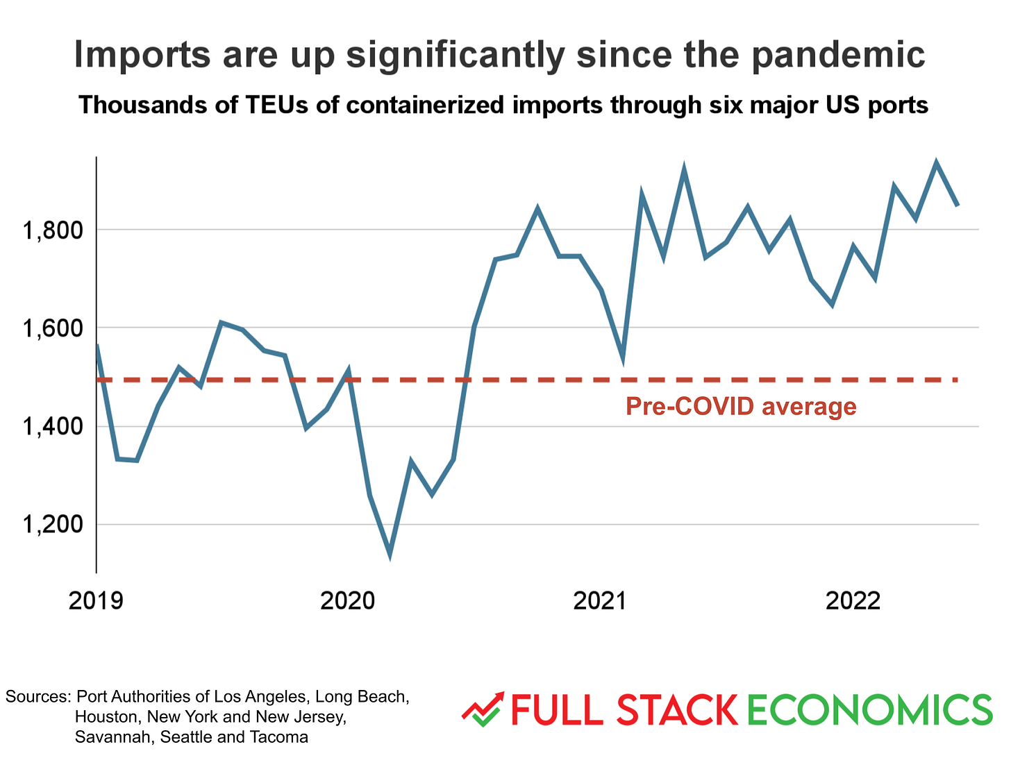
When inflation started rising in 2021, some inflation doves argued that supply-chain shortages were to blame, not loose fiscal or monetary policy. This chart suggests that argument was wrong. It shows the volume of containerized imports through six major US ports between 2019 and today. If the high prices of 2021 were caused by supply-chain problems, we’d expect to see 2021 imports below 2019 levels.
But in reality imports over the last two years have averaged about 18 percent above the pre-pandemic norm. This suggests that the root cause of America’s supply chain problems is that people have a lot of money and are buying stuff at an unprecedented pace.
13. The rising cost of moving stuff around
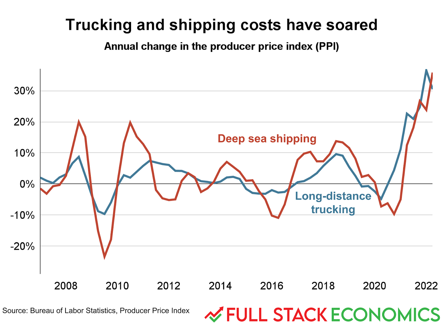
The cost of moving stuff by truck or boat has soared over the last two years. In mid-2022, trucking costs were up about 30 percent, year over year, while deep-sea shipping costs were up 35 percent.
Consumers don’t pay these costs directly, and they aren’t part of the consumer price index. Rather, these figures come from the producer price index, which measures costs born by businesses as they produce goods and services. Of course, businesses typically pass these costs on to customers in the form of higher prices for consumer goods.
14. What markets tell us about inflation expectations
In addition to regular Treasury bonds that pay interest at fixed rates, the US government also sells Treasury Inflation Protected Securities (TIPS) whose principal automatically increases with inflation. If you expect high inflation, you can protect against it by buying TIPS. By comparing the prices of regular and TIPS bonds, economists can derive the market’s estimate of the inflation rate over the next five years.
As you can see, the pandemic initially pushed inflation expectations down, as markets worried about a repeat of the Great Recession. But in mid-2021, markets started to worry that policymakers were making the opposite mistake; inflation expectations peaked above 3 percent in early 2022.
The Fed targets the Personal Consumption Expenditures inflation index, which tends to run a few tenths of a percentage point higher than the better-known consumer price index. But TIPS are based on the CPI. So for the Fed to hit its target of 2 percent PCE inflation, it needs to actually achieve CPI inflation a little above 2 percent. So the current 5-year market forecast (CPI inflation around 2.5 percent) isn’t far off from the Fed’s target (PCE inflation of 2 percent).
Thanks to Aden Barton for research, chartmaking, and editing help with this article.


Thank you for coming back with a bang! Your work is deeply appreciated.
One item, though, regarding your Item 5 which reports: Both high- and low-income households still have about 50 percent more cash in their checking accounts than they did three years ago.
One needs to recall that three years ago checking accounts did not reflect the possibility that the world was coming to an end via a pandemic, et al., which is to say checking accounts now reflect a respect for what might be necessary in an unknown future. The bigger the better!
AUTHOR TIMOTHY LEE: Okay Housing, Education, and HealthCare are much more expensive. But hey, hammers are cheaper!