18 charts that explain the American economy
A fun and colorful way to understand what's happening.

It's a turbulent time for the US economy. The economy largely shut down in March 2020 only to come roaring back a year later with the highest inflation in almost 40 years. No one is sure what's going to happen next.
At Full Stack Economics, we believe that charts are an essential way to understand the complexities of the modern economy. So in recent weeks, I've been looking far and wide for the most surprising and illuminating charts about the US economy. I've compiled 18 of my favorites here. I hope you enjoy it.
If you enjoy these charts, please subscribe to our newsletter so you can get future articles directly in your inbox. It's free!
1. A lightning-fast recovery
To understand the labor market, economists like to focus on workers between 25 and 54 years of age. The employment level of these “prime age” Americans is a good proxy for the health of the overall labor market because they are unlikely to be retired or in school.
This chart, inspired by Skanda Amarnath, shows that prime-age Americans lost jobs far faster in 2020 than in any other recent recession. In just two months, between February and April, more than 10 percent of prime-age Americans lost jobs. But happily that was followed by a rapid recovery. We're on track to reach pre-recession employment levels by mid-2022, about two and a half years after the recession started. For comparison, it took 12 years after the Great Recession for prime-age employment to return to 2007 levels.
2. A tidal wave of cash
In 2020 and 2021, Congress and the Fed pumped trillions of dollars into the economy. You can see the result in the chart above, which I’ve adapted from Joey Politano. Personal income spiked in April 2020 after Congress passed the CARES Act, and again after Congress passed two more major COVID relief bills in December 2020 and March 2021.
As a result, spending—the red line—rapidly returned to the pre-recession trend. To see how remarkable that is, compare it to the previous economic recovery. In 2008, both personal incomes and expenditures fell way behind the pre-2007 trend and never caught back up. In 2020, some economists worried the pandemic would trigger another protracted recession. But thanks in part to aggressive action by Congress and the Fed, we got an extremely rapid recovery instead.
3. The American savings spree
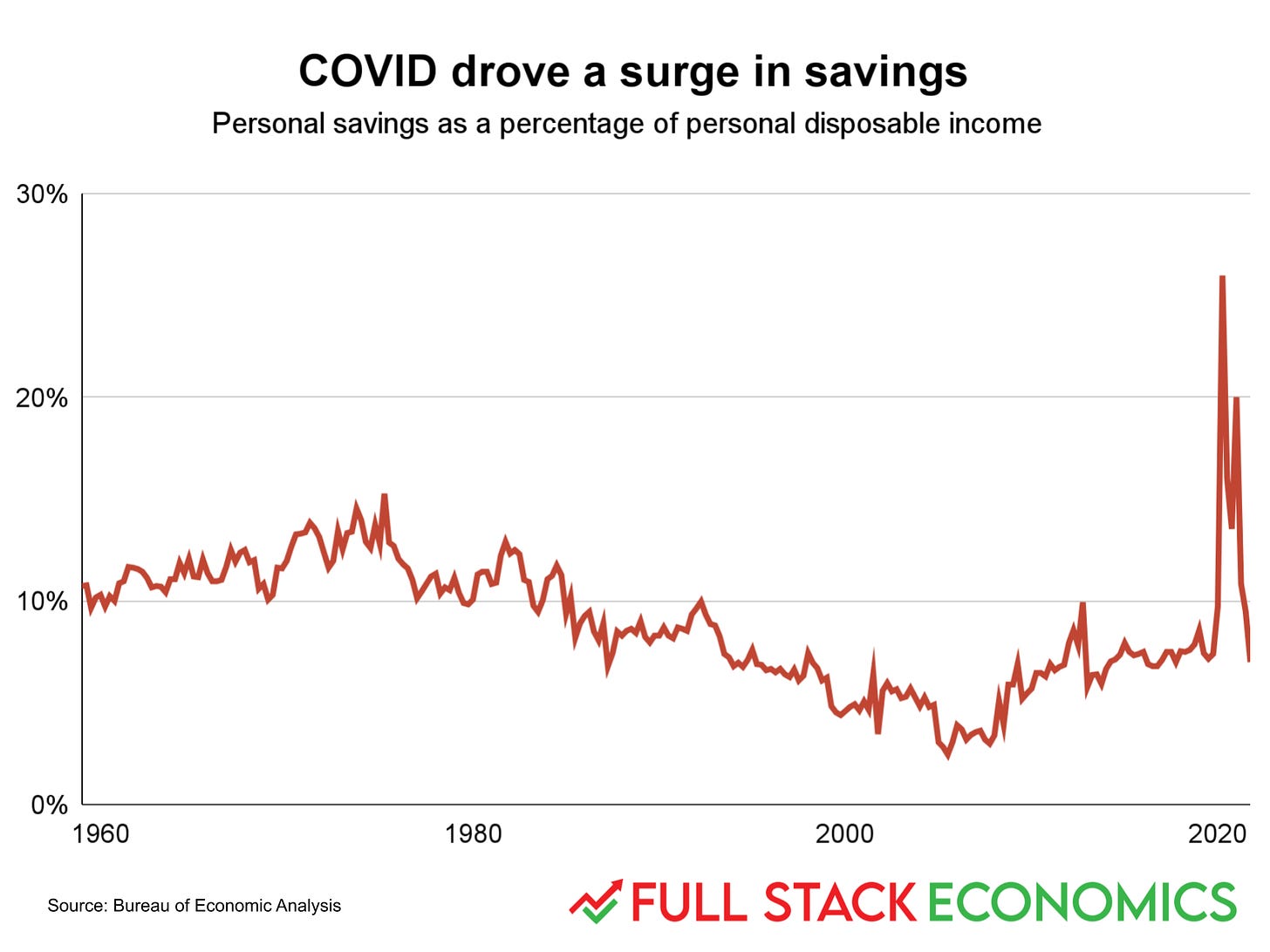
America’s savings rate steadily fell from 1975 to 2005, reaching a low of 2.9 percent. Then the Great Recession scared the public, pushing savings rates back up to around 7 percent by the late 2010s. When COVID-19 hit, a combination of government stimulus spending and the shutdown of many businesses pushed the savings rate up to levels not seen in at least 60 years. But it’s not clear if this will lead to any lasting change in saving behaviors. The most recent figure has Americans saving 6.9 percent of their personal disposable income in November 2021—right in line with the pre-pandemic savings rate.
4. The durable goods spending spree
Americans spend about five times as much on services—which includes housing, health care, and entertainment—than they spend on durable goods like cars, refrigerators, couches, and exercise bikes. But in this chart I’ve indexed the two categories of spending to be equal in 2017. This makes it easy to see that most of the time, the two categories of spending grow at the same rate.
But two recent events have caused big shifts in purchases of durable goods. One was the Great Recession, when spending on durable goods fell sharply. The other was in 2020, when spending on durable goods rocketed upwards. People were suddenly spending less time at restaurants, bars, salons, and other service businesses. That left them with both more money to spend on durable goods and more time at home to enjoy them.
5. Sticker shock
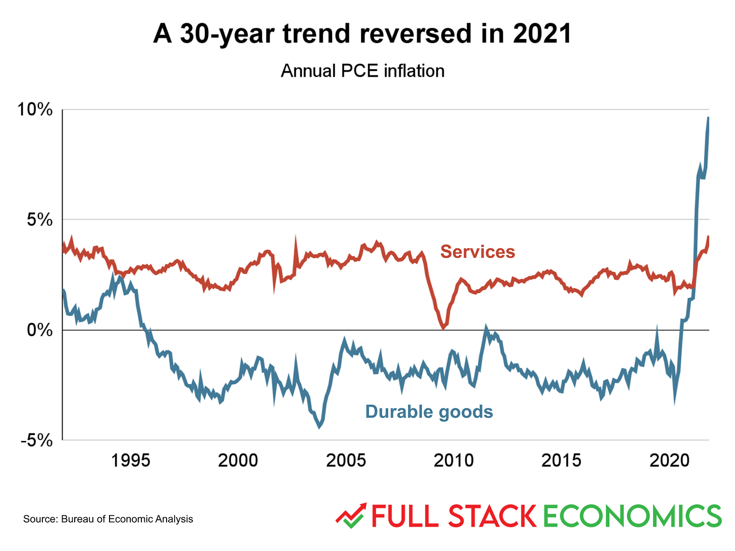
For a quarter century, American consumers enjoyed steadily falling prices for durable goods. But then in 2021 those same prices started to rocket upward, as this chart (inspired by David Beckworth) shows. This is one reason that many economists don’t expect last year’s high 7 percent inflation rate to last much longer. Durable goods are traded in a global market, so if American consumers’ demand for cars and washing machines continues to outstrip supply, foreign companies like Samsung and Ikea will gladly supply more.
The more worrying sign on this chart is actually the recent, small uptick in the services inflation rate. While this looks small on the chart, it matters because consumers spend so much more on services. So even small changes in the average price of services has a significant impact on the overall cost of living.
6. An import boom
One of the factors contributing to high inflation is a massive traffic jam in the nation’s ports. Many articles have been written debating who is to blame for the problem. But this chart, inspired by economist Jason Furman, provides some important perspective. It compares the volume of shipping containers that came into six major US ports between 2018 and 2019 with the volume between 2020 and 2021.
It shows that ports are processing more shipping containers than ever. The volume of containerized shipping, measured in twenty-foot equivalent units, was about 16 percent higher in 2021 than in 2019. That suggests that our nation’s transportation infrastructure is mostly working fine as it deals with unprecedented demand.
7. The great price divergence
Inflation has averaged about 2.4 percent over the last 30 years. But that average figure masks tremendous variation. At one extreme, college tuition has risen at an average pace of 5 percent over 30 years. At the other extreme, the quality-adjusted price of televisions has been falling by about 12 percent per year as this year’s high-end model becomes the next year’s standard model, which becomes the bargain model the year after that.
In this chart, I’ve plotted the cumulative change in the price level for each category relative to the overall price level. As you can see, food prices are right in the middle. The inflation-adjusted cost of food eaten at home is about the same today as it was in 1993. The prices of cars, clothes, toys, and televisions have risen more slowly than average (or even fallen). The prices of medical care, child care, and education have gone up more than average.
This chart acts as an economic Rorschach Test. If you show it to someone with free-market leanings, they’ll notice that the industries with the most government involvement have had the biggest price increases. But someone more left-leaning will argue the chart proves we need regulations and subsidies to make sure everyone can afford expensive but vital services like health care and education.
Fundamentally, I think the divergence is a result of what economists call Baumol’s Cost Disease: it’s easier to raise the productivity of mass-manufactured goods than labor-intensive services. So as wages rise, we have to pay service workers to keep them providing services. And those costs get passed on to consumers.
This chart also reinforces the point that the pandemic and subsequent recovery scrambled the longer-term trends. Prices for college, medical care, and child care all dipped over the last two years, while cars got a small but noticeable uptick.
8. Food and clothing have gotten more affordable
One thing you might have noticed about that last chart is that the necessities of life—food, clothing, and shelter—have all been rising more slowly than average wages. That’s actually a trend that goes back much further than the 1990s, and it's good news for families struggling to make ends meet.
In 1959, the average family spent 19 percent of their budgets on food. That fell to 7 percent in 2019, before jumping back up a bit during the pandemic. The clothing trend has been even more dramatic, with spending on clothes falling from 8 percent to 3 percent.
The story with housing is a little different: households spend a slightly larger share of their incomes on housing than they did 60 years ago. That partly reflects the fact that we have larger homes, on average, than our grandparents did. But it also reflects the fact that the US economy hasn’t done a great job of keeping up with housing demand, leading to rising prices in some areas.
9. The great housing bust of 2009
People like to talk about the housing bubble that supposedly occurred between 2000 and 2006. It’s true that the early 2000s were a period of reasonably strong home construction, but this chart casts doubt on the idea that construction during this period was unsustainable. As I argued last November, the housing bubble was greatly exaggerated. America actually produced fewer new homes in 2005, the peak of the supposed bubble, than in 1978 or 1979.
What’s actually remarkable about this chart is the housing bust that followed the 2007 financial crisis. American housing production fell below historical norms in 2008 and stayed well below average for a full decade. The resulting shortage of housing has been a major factor in today’s high home prices. We’re only now returning to the robust rate of home production that was the norm before to 2007.
10. A global housing boom
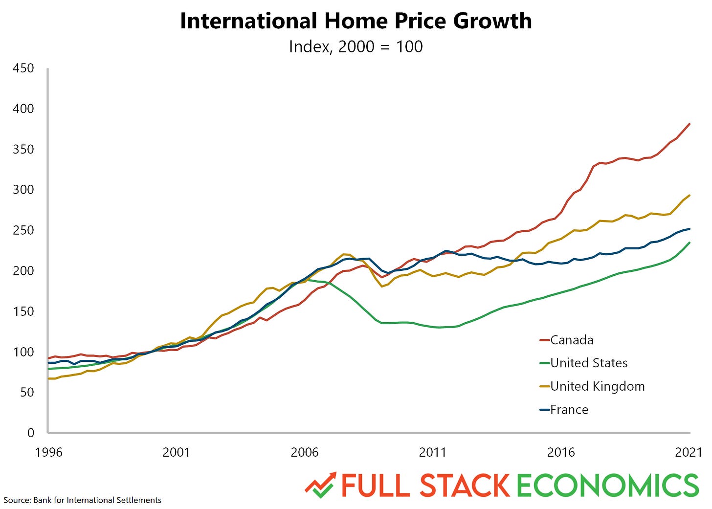
Here’s another reason to doubt the US suffered from a housing bubble in the mid-2000s. I’ve compared US home prices to three of our closest peer countries: Canada, France, and the United Kingdom.
As you can see, home prices soared in all four countries between 2000 and 2006. The booms in the other countries all lasted longer, and went higher, than ours. But then none of these countries experienced a housing crash that was anywhere near as bad as our own. Home prices in Canada, France, and the UK went sideways for a few years, then zoomed further upward. Perhaps with better macroeconomic management, the US could have enjoyed a soft landing like this.
11. Mortgages keep getting cheaper
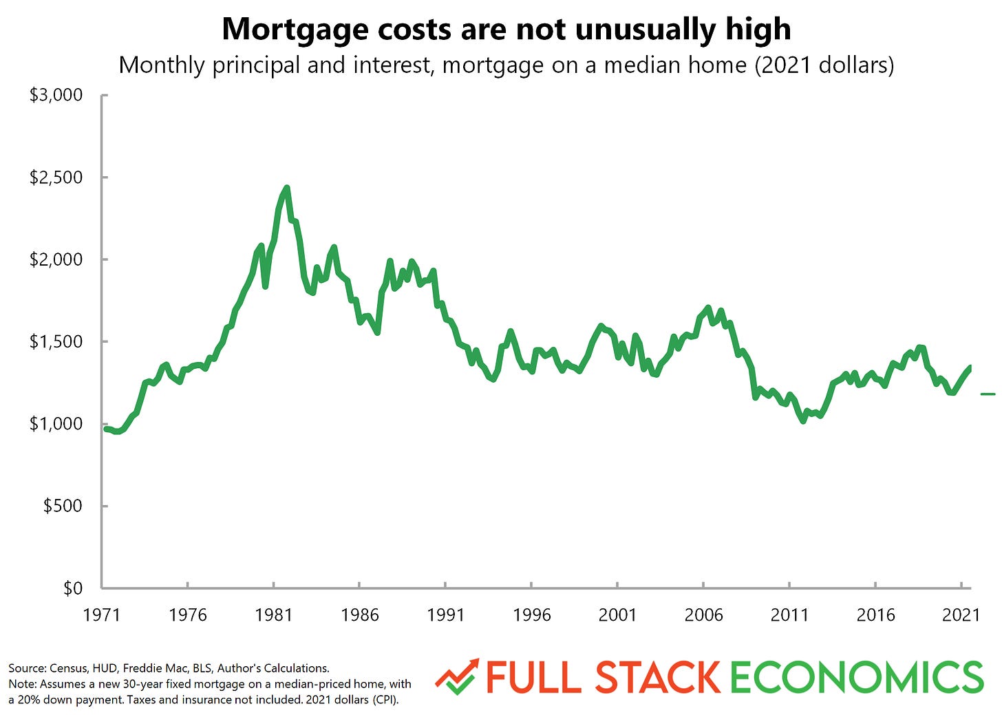
In 2001, the median home cost $265,000, in 2021 dollars. In 2021 the median was $404,000. That’s a 52 percent increase after adjusting for inflation. But over the same period, the average interest rate on a 30-year mortgage fell from around 7 percent to less than 3 percent. As a result, someone who buys a $404,000 home with a 20-percent-down mortgage today actually makes a slightly smaller monthly payment—$1,343—than someone who bought a median-priced home in 2001. The 2001 homebuyer would have paid $1,407, in 2021 dollars. In 1981, mortgage rates peaked at 17 percent. Someone buying a median-priced home that year would have paid $2,387 per month, in 2021 dollars.
Indeed, this dynamic goes a long way to explaining the rapid home price increases of the last 20 years. What most buyers care about isn’t the price of the house, it’s the size of their monthly mortgage payment. As mortgage interest rates fall, buyers’ ability to pay rises proportionally. And that has pushed home prices upward.
Of course, homeowners also have to worry about making a downpayment, and those have risen along with home prices. So saving enough for a downpayment is a more significant constraint for homeowners today than it was 20 years ago. So having a wealthy relative to help pay your downpayment is a bigger advantage today than it was 20 or 40 years ago.
12. The great exodus
When COVID-19 hit, a lot of white-collar workers suddenly got the freedom to work anywhere in the US. This chart shows the dramatic result. It’s based on new research from economist Paul Williams, a fellow at the Jain Family Institute.
The vertical axis shows each metro area’s average rent compared to the national average. Rents in San Francisco, for example, are about $1,000 above the national average. The horizontal axis shows how each city’s population growth trend changed after February 2020. San Francisco, for example, was already losing residents before the pandemic struck, but its population decline accelerated after February 2020.
This chart shows a clear pattern: the most expensive cities took the biggest hit in their population growth rates after COVID-19 hit. Meanwhile, the pandemic seems to have boosted the populations of cities like Detroit and Grand Rapids—or at least slowed their rate of decline. A notable exception to the pattern is Honolulu, which unsurprisingly attracted more people in the COVID-19 era despite high rents.
Back in August, my colleague Alan Cole wrote about the related phenomenon of the Mountain Lion cities: nine Western cities that have been welcoming housing refugees from high-cost California in recent years. Williams’s data confirms that the pandemic accelerated the growth of several Mountain Lion economies, including Ogden, Utah; Boise, Idaho; and Spokane, Washington. But surprisingly, Williams finds the pandemic actually slowed the previously rapid growth of the two Mountain Lion cities in Arizona: Phoenix and Tucson.
13. Economically, the pandemic is far from over
Most Americans today carry a cell phone with them almost everywhere they go. This gives Google access to a massive amount of fine-grained data about people’s day-to-day movements. As a nice side effect, Google is able to publish precise day-by-day data about where people spend their time.
As you’d expect, people spent a lot less time in workplaces, on public transit, and shopping in the early weeks of the COVID-19 pandemic. Those numbers have all been moving back upwards since then, but we are still far from fully resuming our old routines. Americans collectively spend 20 percent less time in the office and on transit than we did two years ago. People are also spending a bit more time at grocery stores than we did before—probably the consequence of people who are still avoiding restaurants.
14. What keeps workers out of the office
I’m a father of three young children, so child care difficulties loom large in my personal experience of the pandemic. I found this data from the Bureau of Labor Statistics surprising. Each month, the BLS asks workers if they were at work during a particular week. This chart shows the reasons people gave if they said they had a job but weren’t at work the week of the survey. People take the most time off for vacation, followed by sick days. Taking off work to care for others—whether a newborn baby, an elderly parent, or a toddler whose daycare has been shut down by COVID—lags far behind.
COVID did roughly double the number of employed people missing a week of work due to child care problems. But the absolute number is so small it’s hard to even see this on the chart. And friend of the newsletter Joey Politano cautions that this statistic under-counts the total number of workers experiencing child care problems. Workers who take the BLS survey can easily get confused about the difference between “I have a job but I’m not working this week” and “I don’t have a job.” Workers who have left the workforce entirely due to child care problems aren’t reflected in this chart. The chart also doesn’t reflect the millions of people who have cut back their hours or who suffer reduced productivity trying to work and watch kids at the same time.
15. Tight labor markets are good for low-wage workers
The Atlanta Federal Reserve publishes data on wage growth broken down by income quartile. In this chart, I compare workers in the top 25 percent of the income distribution (red) to those in the bottom 25 percent (blue) As you can see, we’ve had strong wage growth since 2015, and wage growth has been especially strong for low-wage workers. I wrote about this trend back in December.
Indeed, there’s a long-term pattern here: low-wage workers tend to have the slowest wage growth during recessions and the fastest wage growth during economic booms. This is a big reason that many left-leaning economists view tight labor markets as a top policy priority. Joe Biden has embraced that view, and it’s one reason he asked Congress to pass a $1.9 trillion stimulus bill in March 2021.
16. Net migration to the US is way down
Strong demand is one factor driving today’s tight labor markets. Falling immigration is another. The Trump Administration was hostile to legal immigration and managed to cut net migration levels by more than 50 percent between 2016 and 2020—despite a strong economy that would have otherwise drawn in extra workers.
The pandemic provided Trump with a rationale for further restricting immigration in 2020. The border was closed to virtually all migrants for a few months starting in 2020, and since then the government has struggled to catch up with a backlog of applicants. The Census Bureau hasn’t published final net migration figures for 2021 yet, but the Cato Institute’s Alex Nowrasteh and Michael Howard estimated back in November that net migration would fall further in 2021 to around 400,000 people—the lowest level in more than a decade. Nowrasteh has harshly criticized the Biden administration for failing to expand legal immigration despite promising to do so on the campaign trail.
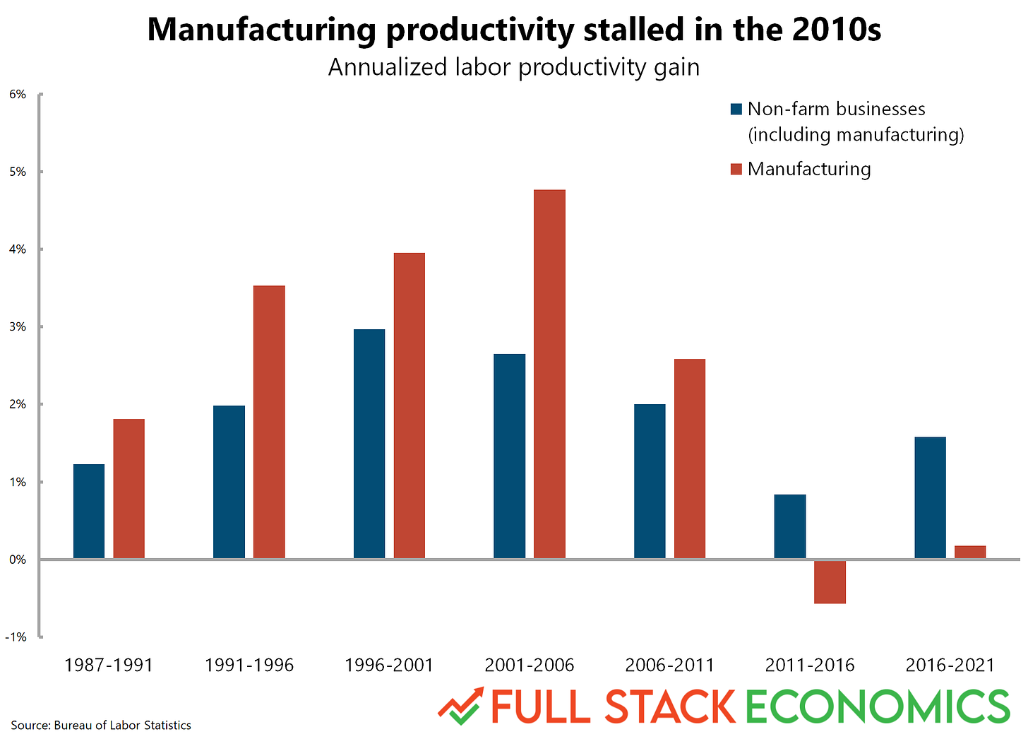
17. A surprising slump in manufacturing productivity
Back in 2016 I wrote an in-depth article for Vox about slowing productivity growth in the American economy. One of my main arguments was that it’s hard to improve the productivity of service workers. After all, a barber completes about as many haircuts today as in 2002 or 1982. So, I argued, it’s not surprising that productivity has declined as the economy has shifted from manufacturing to services. My 2016 article included a chart showing that manufacturing workers achieved above-average productivity growth between 1989 and 2014.
Last week, I went back and updated the chart with the latest data. And I was surprised to find the picture has totally changed! Worker productivity in manufacturing peaked in 2013. Then it declined by more than 6 percent between 2013 and the start of the pandemic. The post-COVID boom has pushed manufacturing productivity back upward but it’s not clear if this is a temporary bump or the start of a new trend. This is something I want to write more about in the coming weeks.
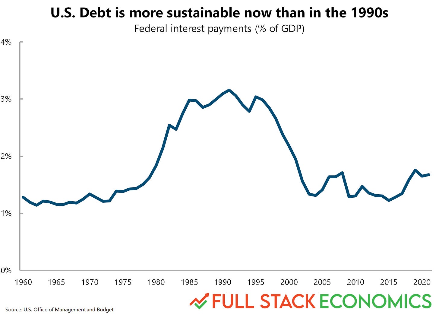
18. Why many economists aren’t panicking about the national debt
In 2020, pandemic-related stimulus spending pushed the national debt held by the public to highs not seen since World War II. This figure was 125 percent of gross domestic product (GDP) in 2021, up from 94 percent in 2011 and 55 percent in 2001. So why aren’t more experts concerned? Interest rates have been steadily falling over the last 20 years. In 2001, the interest rate on 10-year government bonds was around 5 percent. In 2011 it was 2.8 percent. In 2021, it was 1.45 percent. As a result, net interest payments haven’t changed very much even as the national debt has soared.
Perceptive readers might notice that this is the same basic story I told for mortgages earlier in this piece. Just as falling mortgage rates enabled homebuyers to borrow more money and bid up home prices, falling interest rates on government debt enable the federal government to borrow more money without paying high interest.
You might be wondering if this is sustainable. If interest rates shot back up to the high levels of the 1980s or even the early 2000s, then American taxpayers would be forced to shoulder a much bigger interest burden. But my colleague Alan Cole has argued that interest rates are likely to stay low for a long time.
If you enjoyed these charts, please subscribe to our newsletter so you can get future articles directly in your inbox. It's free!


